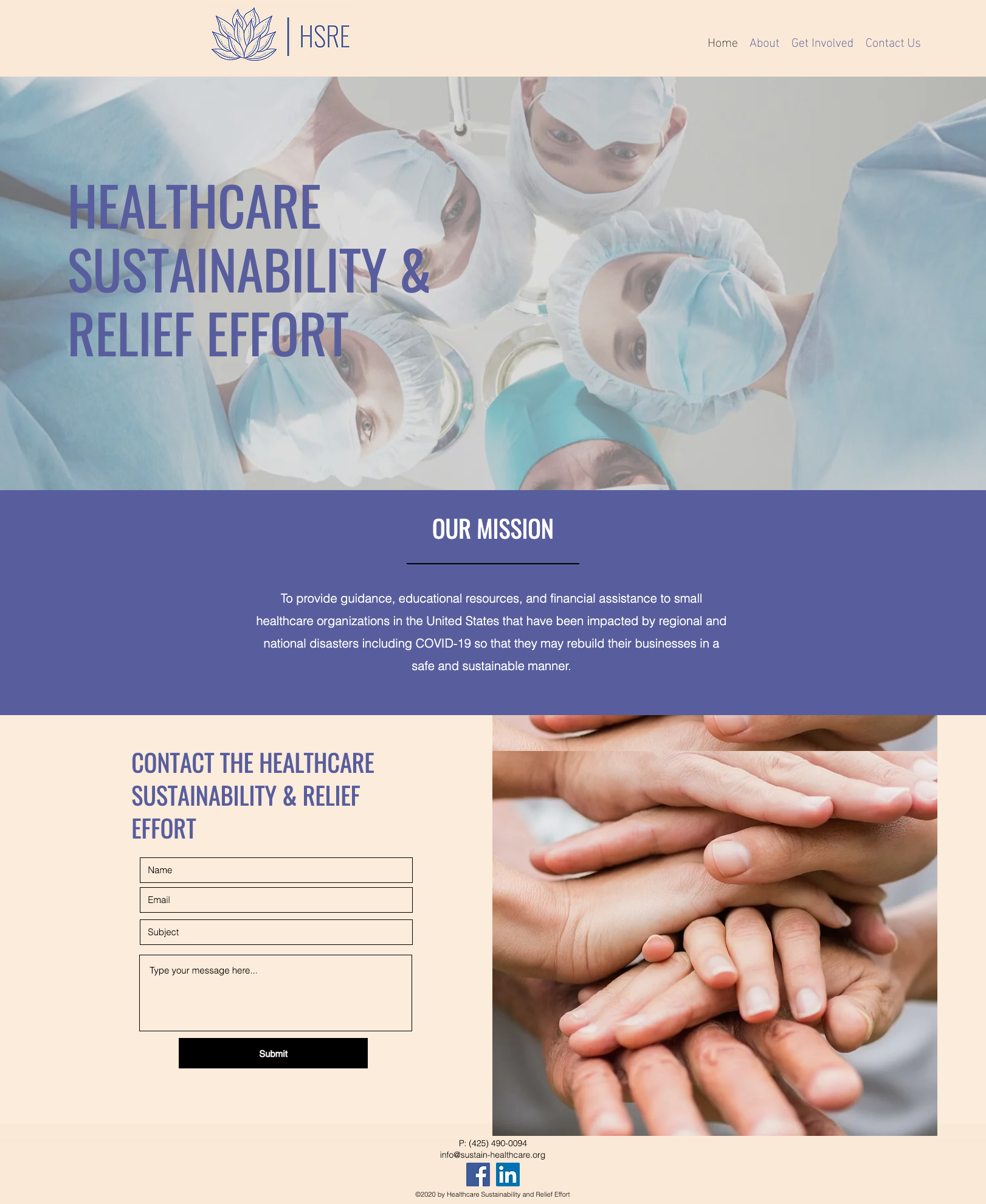
HSRE is a nonprofit organization that was founded in response to COVID-19 and aims to provide assistance to small healthcare organizations that have been impacted by disasters so that they may rebuild their businesses safely and sustainably.
Rationale
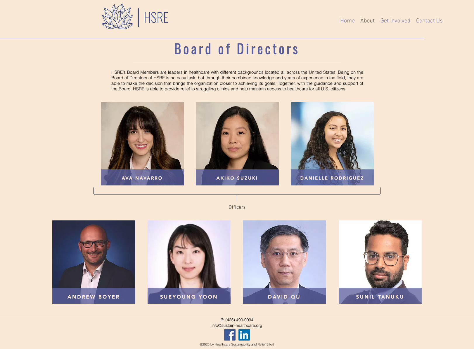
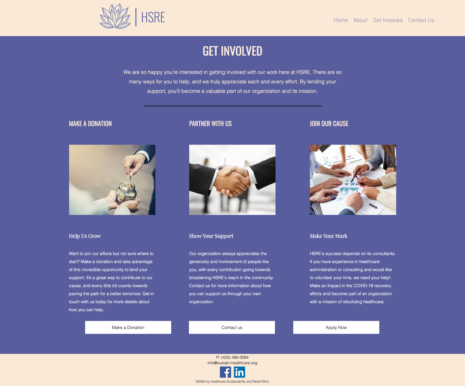
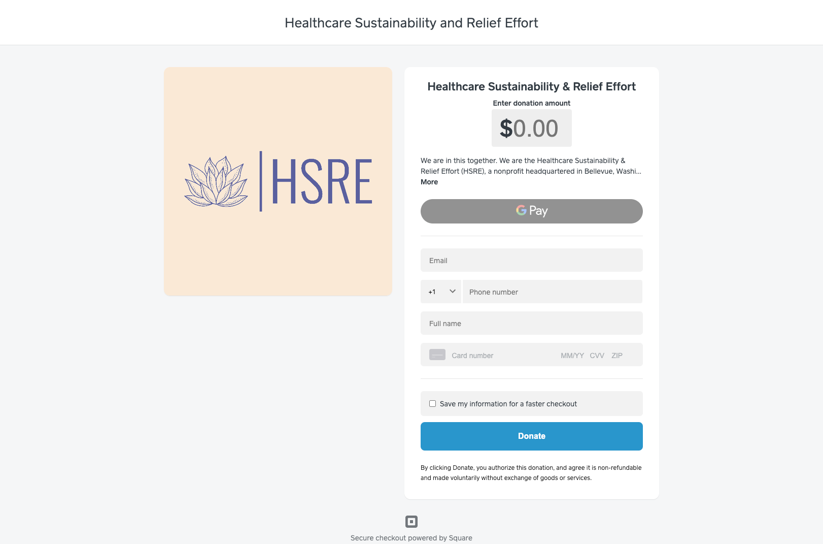
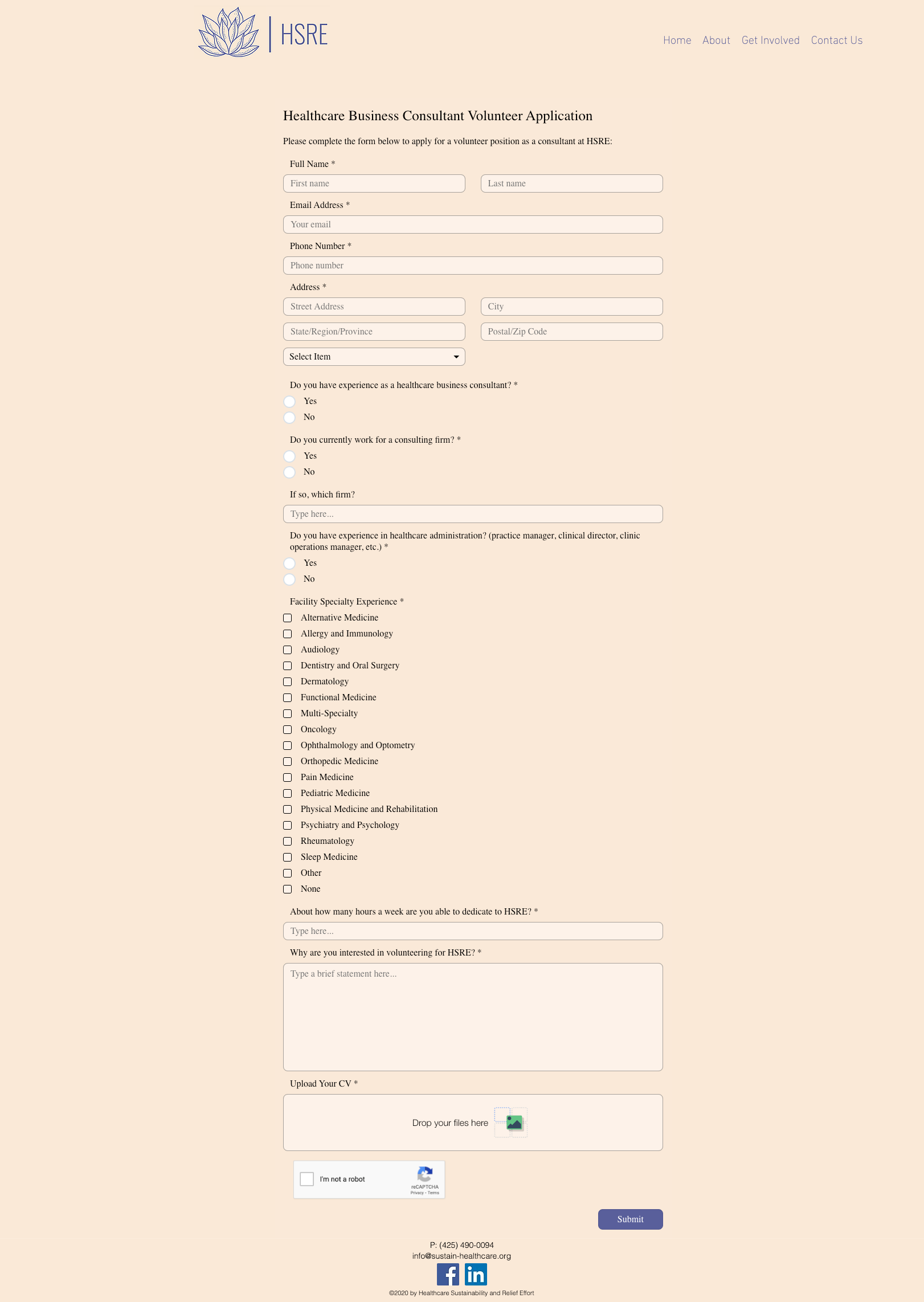
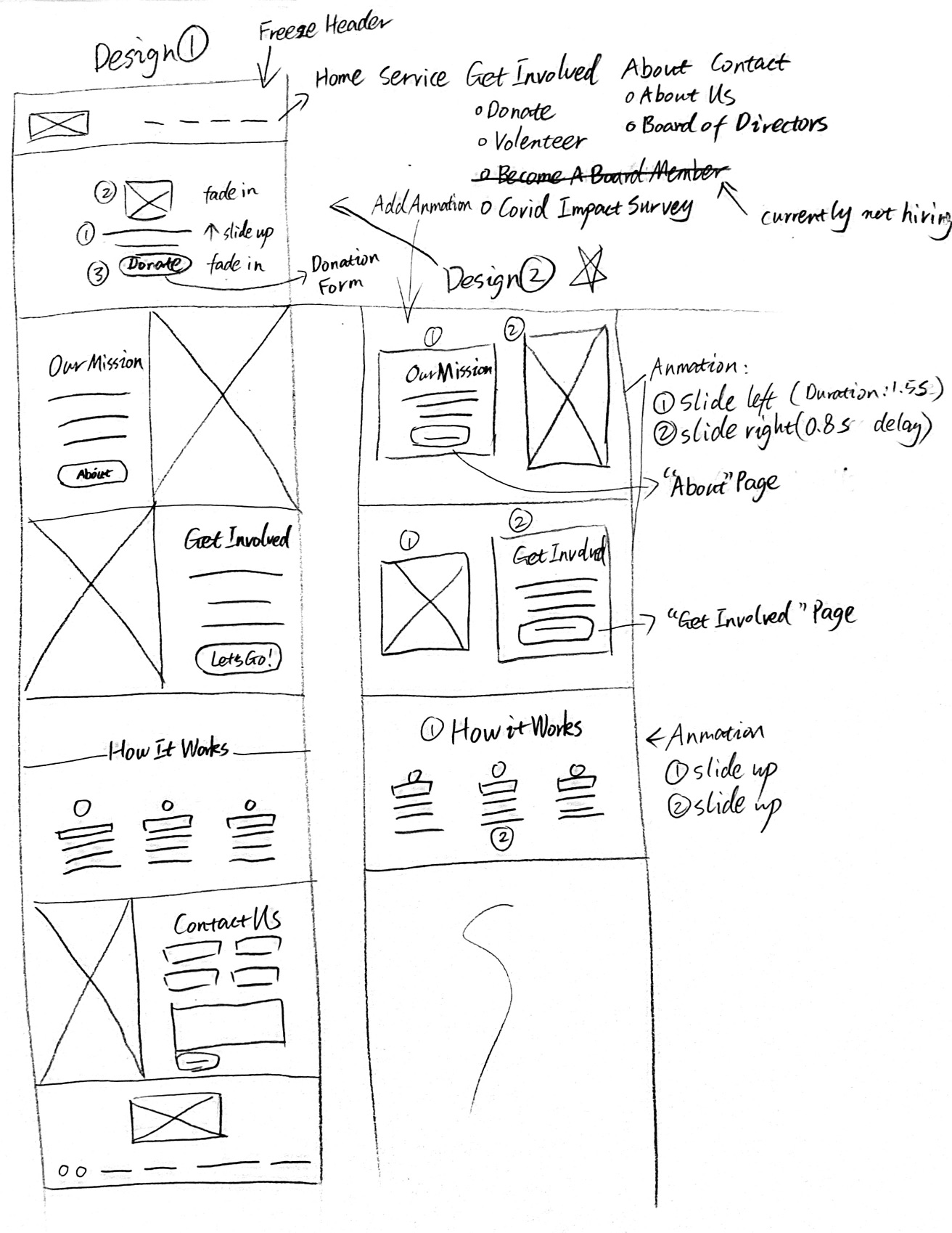
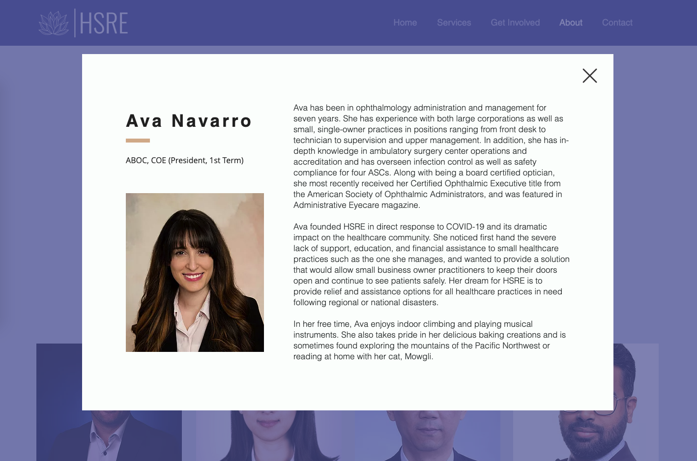
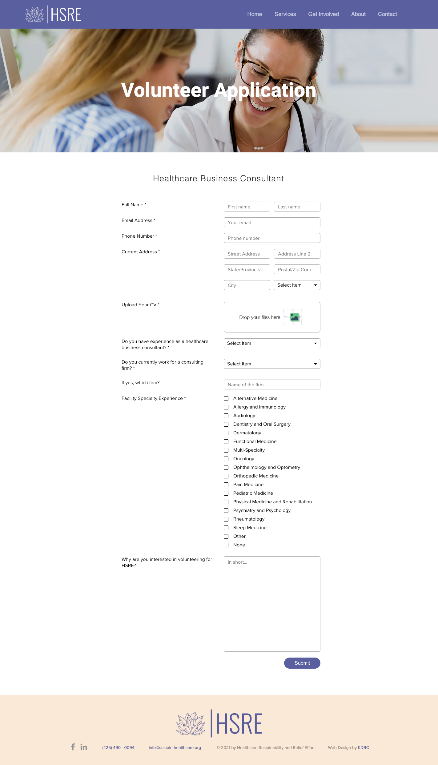
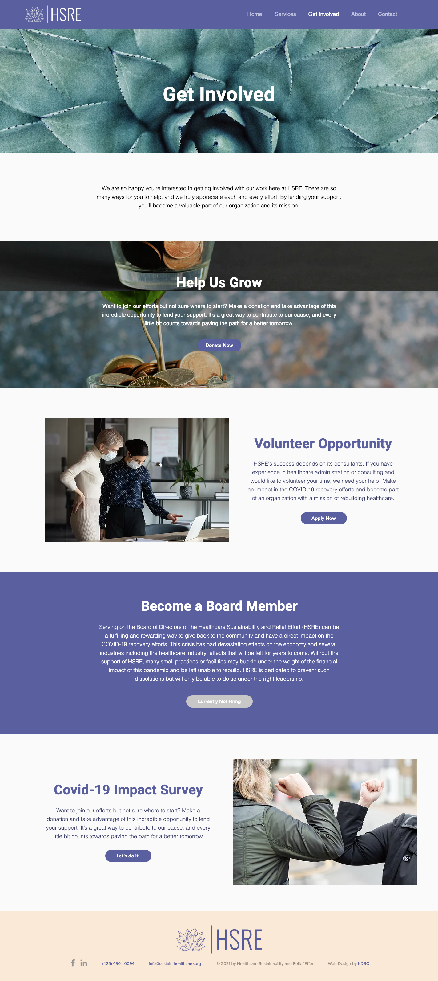
Ava had a problem with white space, her application forms for board members and volunteers were long, the donation page took visitors outside of the website, and finally, clicking on each board member’s bio forced the user to use the menu bar to navigate to the previous page. Ava had quite a lot of content, however, she didn’t know how to structure it in website format.
Scope: Restructure information architecture, improve user experience, and the aesthetic of the entire website.
Ava: “I like its unique style and clear theme. I don’t like that a few areas look a bit messy and cluttered.“
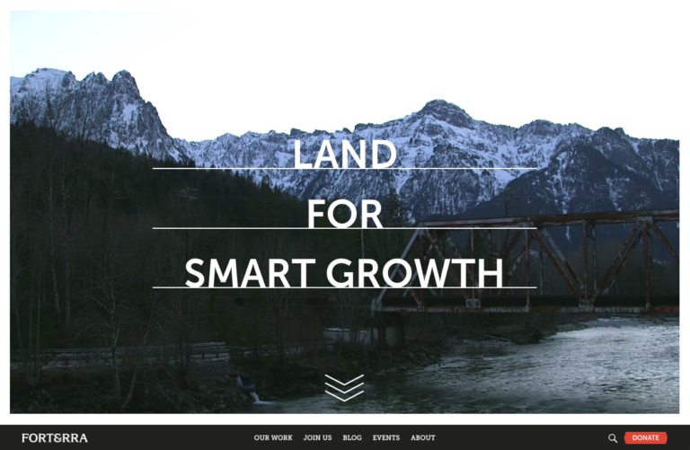
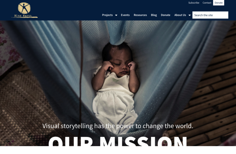
Ava’s choices had nothing in common with her current style, although I know that she liked modern styles with large images and bright tones. She also liked how some of these websites’ navigation systems.
Wireframes
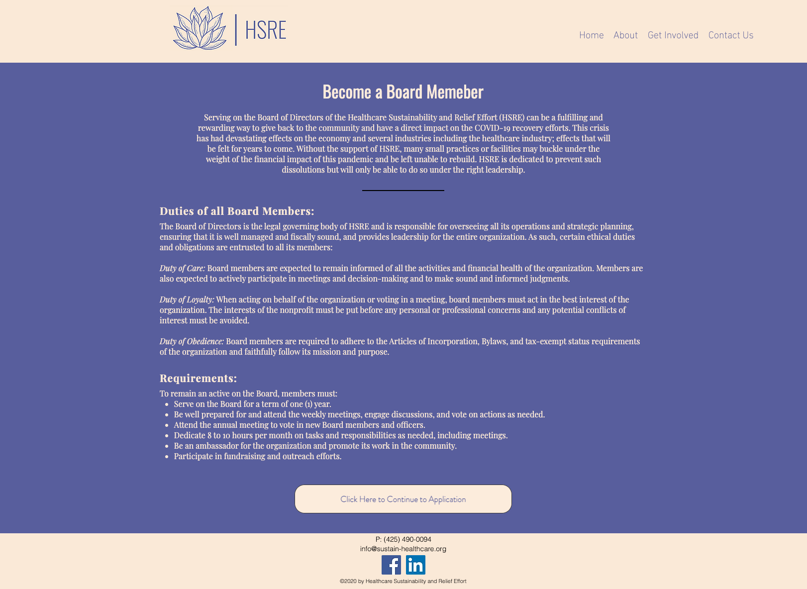
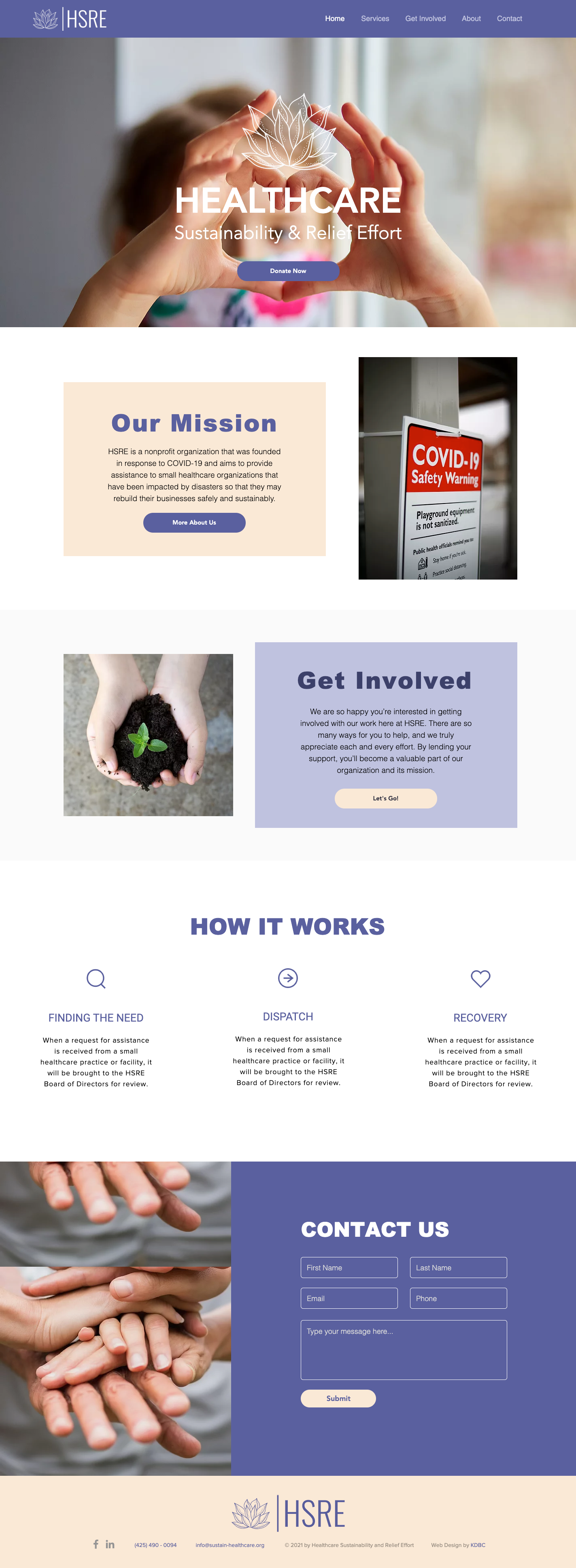
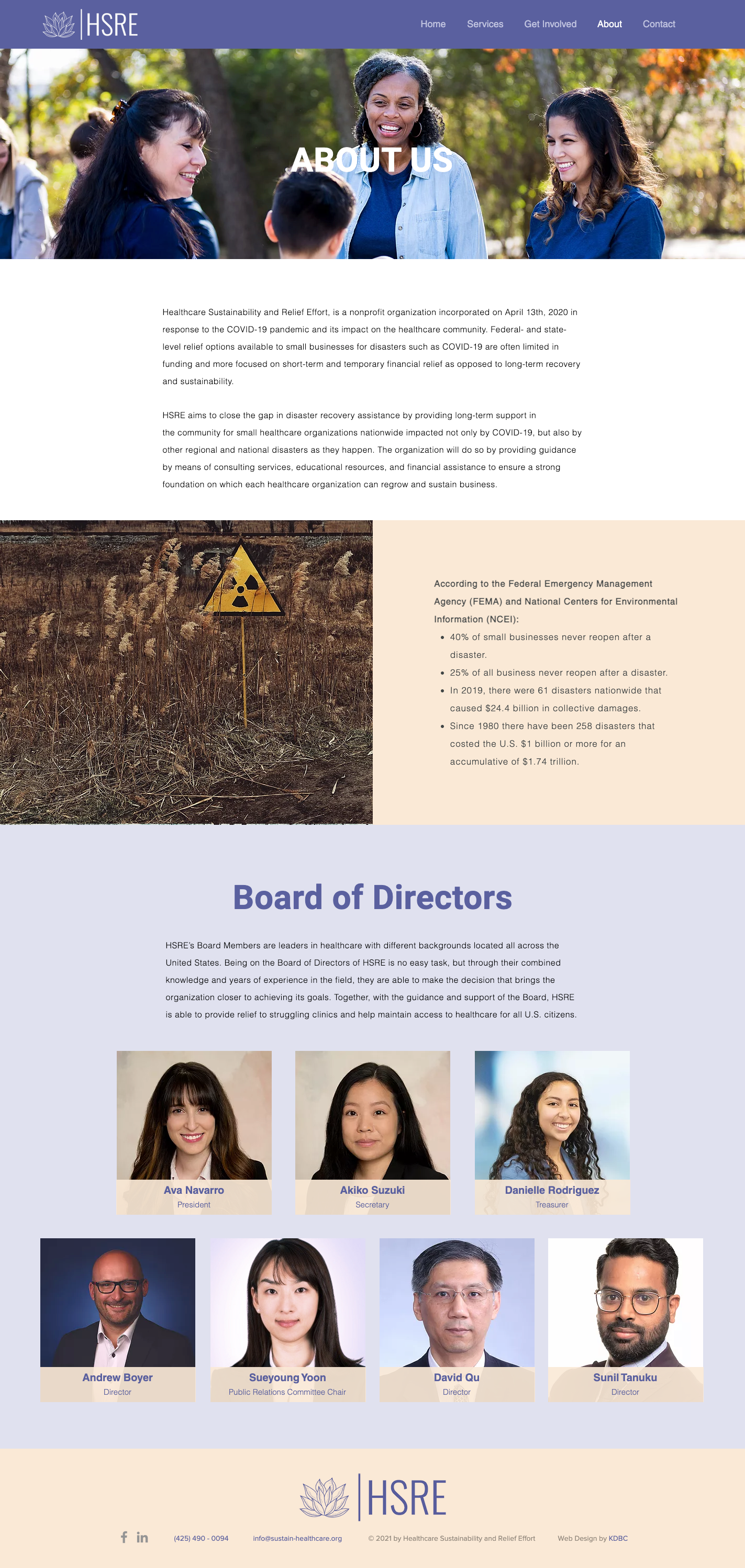
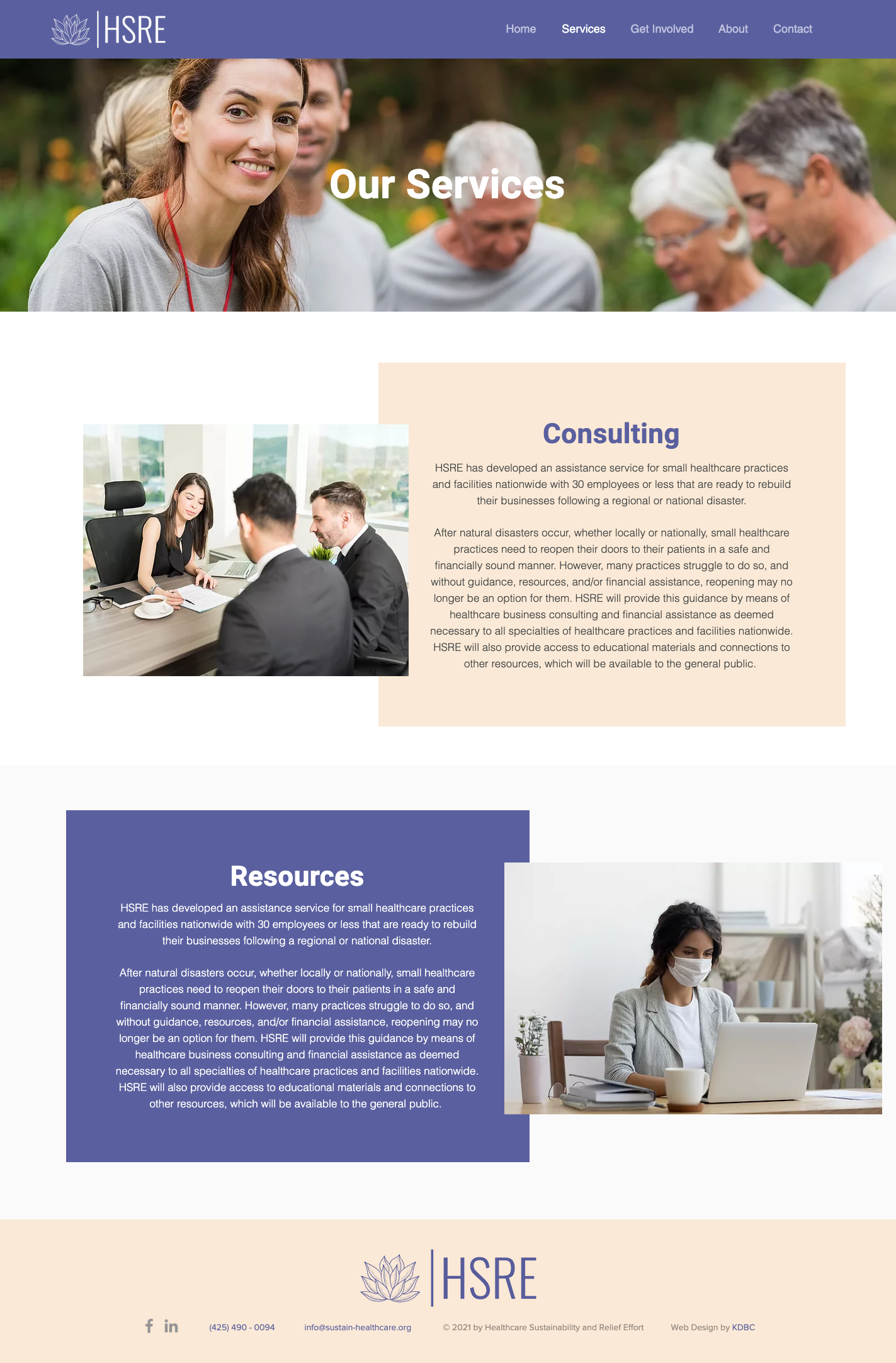
Originally, all of Ava’s pages were short and the information was scattered. My solution was to use a combination of pages with anchors as her drop-down menu items. This method consolidated the information into fuller pages and allowed the users to explore without much interruption.
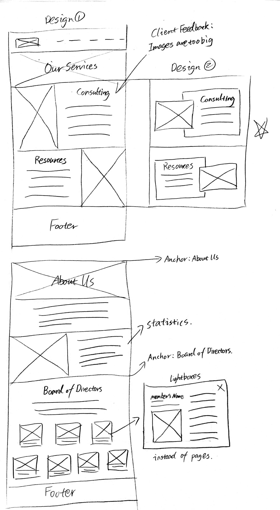
The organization currently is not hiring board members, however, they still want people to see the job description. I decided to remove become a board member from the menu while still keeping it in get involved. I presented the information with the rest of the menu items but colored the button to apply board member to gray, while the color changed to red on hover. While the visitor can still click on the button and see the job description in the lightbox, the job can not be applied to.
Lastly, a second layout was presented and some simple animations were applied for her as requested.
The New Site
The final result has improved from the first design. Ava is happy with the look and how it functions. The anchor menus are useful and do not make the users visit short pages anymore. The users can now exit out of a board member’s bio instead of visiting a different page and having to go back and forth. The application forms and the donation form seem shorter and sleeker. There is a reasonable amount of white space and colored backgrounds as Ava likes it. The animations also added more life to the website.
Client Feedback
Rated 5 out of 5
Ava Navarro: “This is so much better than what we had. The navigation is so much more clear now, and I love the form format and the use of light boxes!”