King County Bus

Easy on-boarding and stress-free bus riding experience for ANYONE.

School: LWtech    |    Professor: Benjamin Meyer    |    Type: App Interface   |    Role: Lead UX Designer

King County Bus

Easy on-boarding and stress-free bus riding experience for ANYONE.

School: LWtech

Professor: Benjamin Meyer

Type: App Interface

Role: Lead UX Designer

Problem

Compared to other major cities, Seattle is behind on efficient public transportation. Our bus system relies on tickets, cash or Orca cards, all inconvenient payment methods. The current bus app only provides an overview of the trip which is not helpful to people who have a hard time knowing which direction to turn. The trip ends up consuming the whole day. The rider would constantly use the app to monitor progress, draining phone battery and potentially leaving them high and dry. Foreigners are unfamiliar with how to request stops or use the system.  

Solution

The new app I designed takes advantage of GPS and notifies the rider when a bus is close or when to get off,  reducing screen time and saving battery.

Being able to use a QR code to pay for the buses makes traveling a lot more manageable.

After the rider has gotten on their first bus, the app will run 2 short tutorials: How to request a bus stop and to turn off the screen and let the app send notifications in order to reserve battery. 

Result

Reduced the number of clicks during the daily commute from 10+ to 3. Included the payment method within the app. Saved battery life during a long commute by 80%. Greatly reduced the anxiety level of bus riding in a foreign country.

original app vs. my new app ⟶

King County Trip Planer

Research

Problems

To test how the King County Trip Planner works, I tried to use this app to navigate around the Kirkland area (20 minutes northeast of Seattle), it failed my expectations. Below are the problems I have identified throughout the journey:

Inconvenient Search: The app recognizes only a handful of “famous landmark” names, but it’s not up to date with other names of businesses, institutions, or organizations. This means that searching by names is useless and you might end up searching by addresses all the time.

Confusing Hierarchy: Not only is the screen too crowded, the text is in all caps, which conveys shouting and is exhausting to look at. The colors all demand your attention which leads to inattention, making it even harder to concentrate on task.

Draining battery: A bus rider needs to constantly look at their phone to know where they are, thus resulting in the battery dying fast during a long day of commute. 

Is the Orca card really helpful: For Seattle citizens, yes, but for tourists, no. Orca cards require people to preload money into the cards. And you can’t buy them from a bus station. 

All of these problems are discouraging people to choose buses to commute. Only if we come up with solutions to these problems, we’ll have more bus riders in our city.

Contextual Inquiry:

Who is Going to Use the King County Bus App?

  • Seattle local who…
    • Doesn’t have a car
    • Is trying to avoid traffic
  • Seattle new transplants who…
    • Is trying to figure out public transportation for the first time
    • Is trying to explore the cities by riding a bus
  • Domestic/international tourists who
    • don’t have a rental car
    • don’t speak English

Who will use the King County Bus App?

  • They are trying to ride a bus for the first time
  • They ride a bus every day

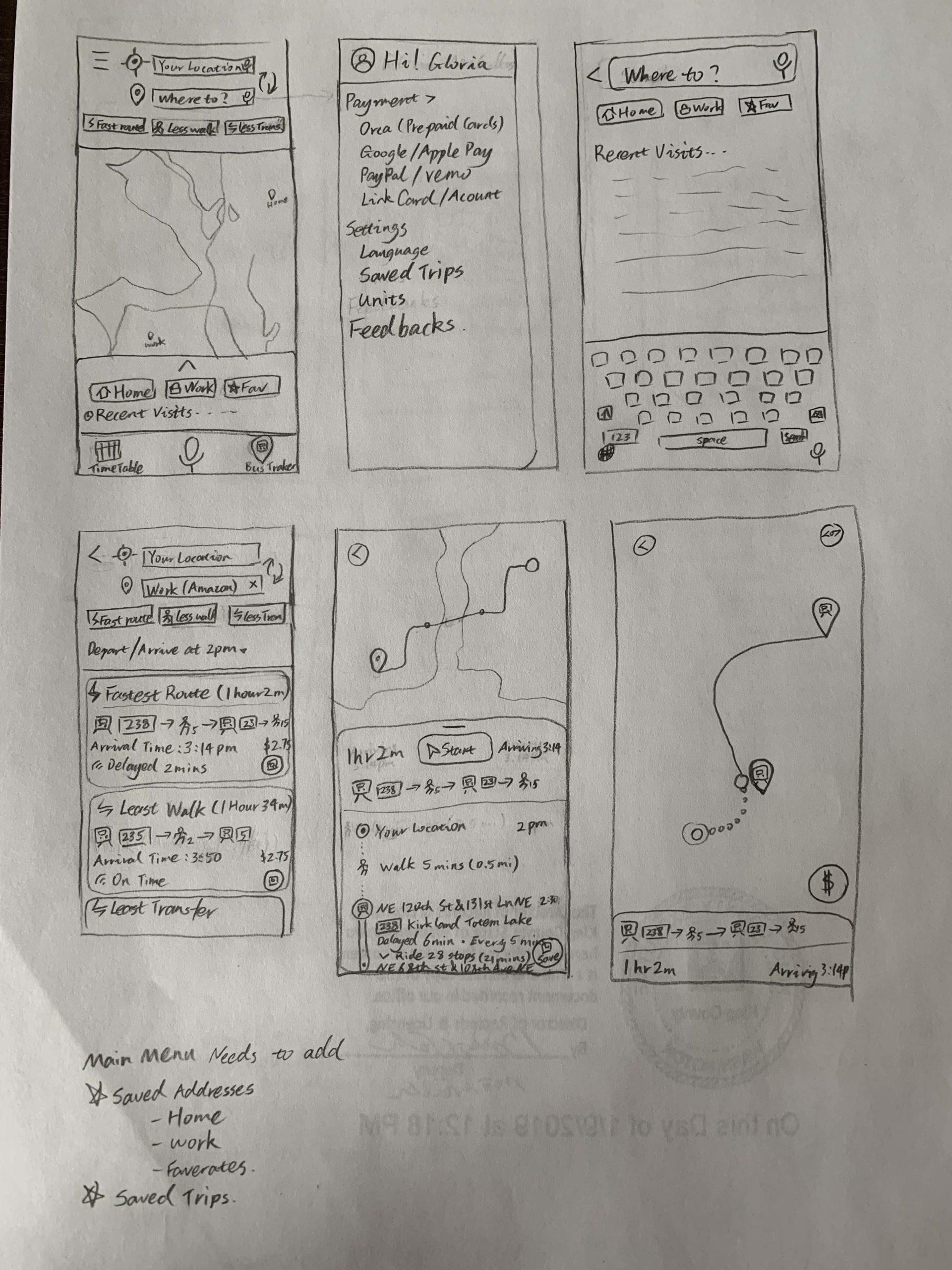
What Tasks Are Desired?

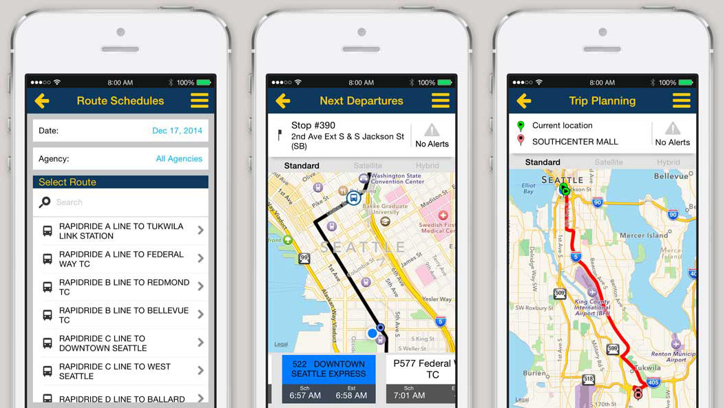
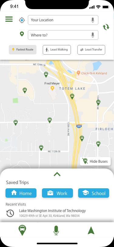
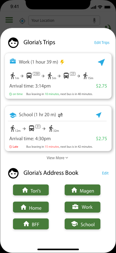
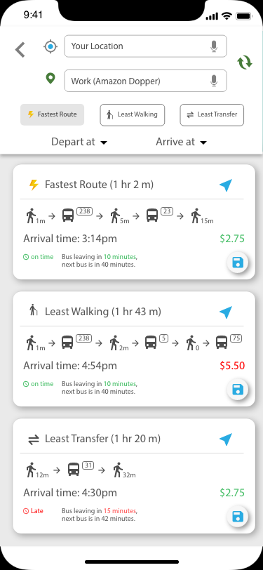
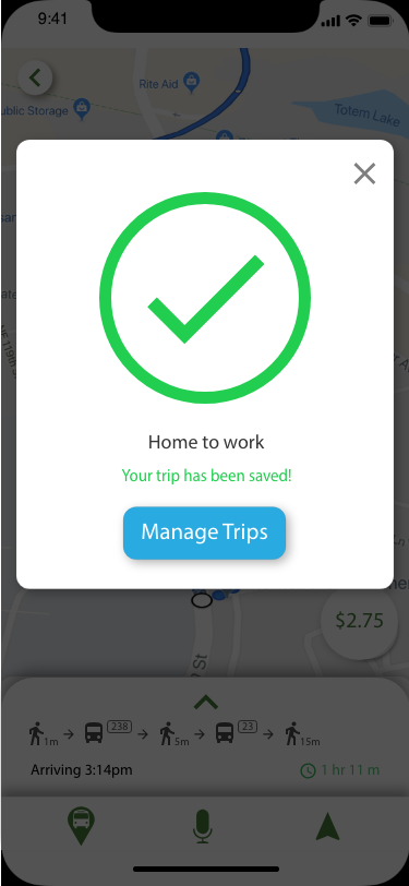
  • Plan a trip using the King County Trip Planner
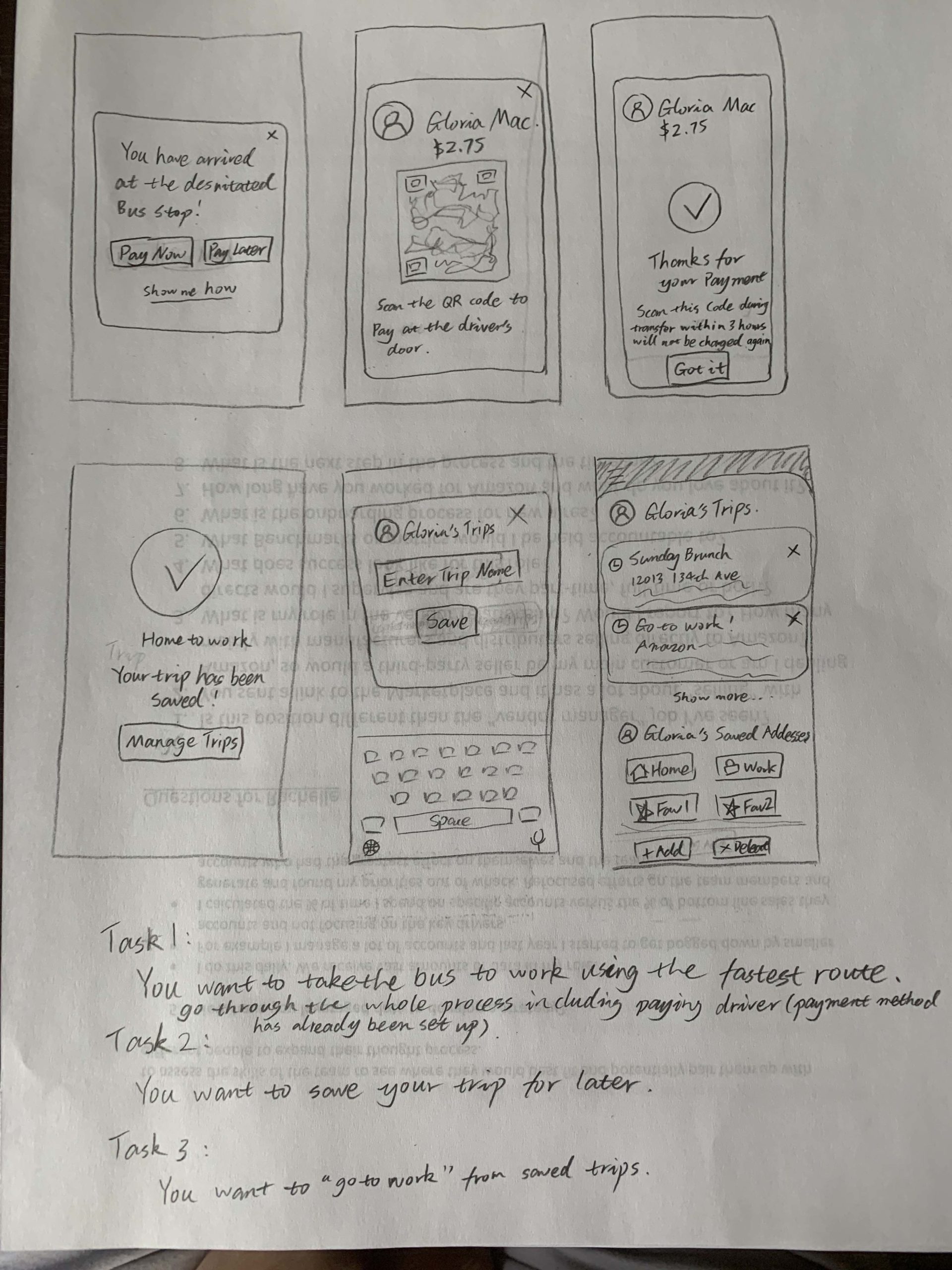
  • Take the bus to the desired destination

How Are The Tasks Performed?

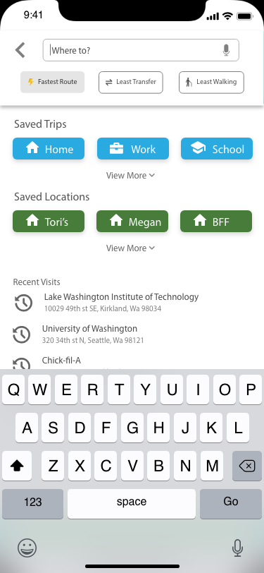
  • Intuitively go to their site on mobile and tap on Trip planning
  • Tap on “current location” icon under “From”
  • Put in the destination address
  • No response…

What other tools does the user have?

  • Google Maps
  • Apple Maps
  • King County trip planner desktop version

How often are the tasks performed?

  • Everyday
  • While traveling

What are the time constraints on the task?

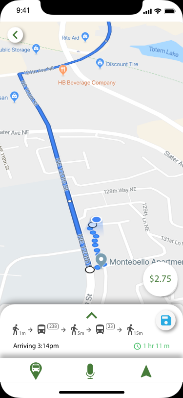
  • Buses can add up to 4 times as much time to a trip
  • Buses can be reliable during traffic since it can travel in carpool lanes.

What happens when things go wrong?

  • Taking the wrong direction will cost more money and time
  • Confuse the rider and causes anxiety of riding a bus in the future
  • Cause the rider to be late

Identify 2 key areas that need to be addressed:

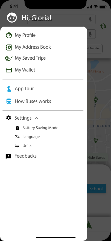
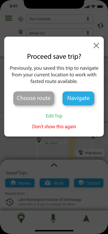
  • The King County Trip Planner is not designed for new users.
  • The address search engine do not recognize many names of a location, and the “Landmark” is a long dropbox.

How Might We? Assess your results: 

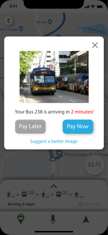
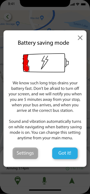
  • How might we make it less overwhelming when looking at a bus schedule?
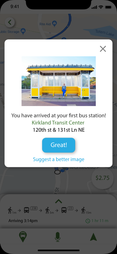
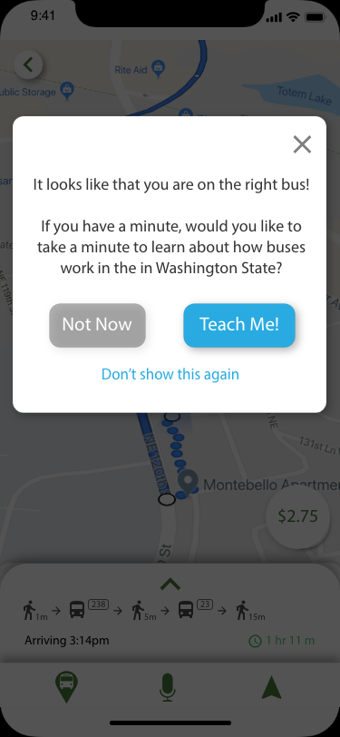
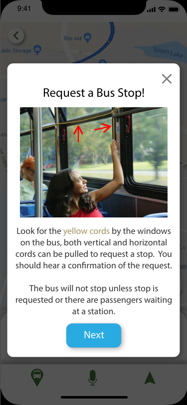
  • How might we make sure we are at the right bus stop as a tourist?
  • How might we make the mobile app easier to use?

Persona:

Card Sorting:

Feature Prioritization:

Site Map:

Low Fidelity Wireframes:

Paper Prototype:

To test the wireframes we created, the users are using this paper prototype and asked to perform the following tasks.

Scenario: You have just downloaded the app and set up your payment methods and saved your Home and work addresses.

Task 1: You want to take the bus to work using the fastest route, go through the whole process including paying the bus driver. 

User 1: Success! It was quite easy for the contestant to navigate through this process. 

User 2: Success! Quite easy to navigate

User 3: Success! It was very easy to navigate and get through.

User 4: Success! Easy!


Task 2: While performing going to work tasks, you changed your mind and want to save your trip for later.

User 1: Fail! The save button was easy to miss. This user prefers the button was more than just an icon.

User 2:  Success! Vaguely understood, was confused through the process but made it all the way through

User 3: Success! It was very easy to get through.

User 4: Success! If the save icon was clear, the user would have found it without a problem.

Task 3: Previously, you have saved your trip. Now, from the home page, you want to “Go to work” from saved trips.

User 1: Fail! The user did not understand the designer’s thought process. (Saved trip is different from saved destination. Saved trip is a trip that user have already input the starting point and the destination, how the user will get there, or even include the date and time the trip will take place. Saved destination is simply a book mark, each time user have to choose what route they’d like to choose.)

User 2: Success! Found button easily on home page for go to work. 

User 3: Success! Button was easy to locate on the home page illustration.

User 4: Success! Got it!


Next Steps:
  • On the trip overview page, make Save icon sticky. Or, move it up so it’s side by side with the “Start button”.
  • On choosing your routes page, move the save button on top, or use animation to guide a first time user.
  • On the home page, the swipe up card needs an indication of “Saved Destinations” or “Saved Trips”.
  • On the main menu, there needs to be a section of “Saved Places” and “Saved Trips”. A pop-up window will explain each section the first time the user tapped on each of them.

High Fidelity Mockups:

High Fidelity Prototype:

Here are some available tasks for you to play around:

Task 1: You want to go to work using the search feature, during this task, you changed your mind and wanted to save the fastest route for later. Finally, check out saved trips.

Task 2: Now, from the home page, you want to go to work with the fastest route. Go through the whole process including paying for the bus driver

Note: While navigating, there are several auto popups that are designed to alert the user when the user has arrived at the bus station, and when the buses are arriving soon. Simply trigger it by tapping the center of the navigating screen. 

Conclusion:

For the scope of this project, the style wasn’t the most important part, I borrowed a lot of inspiration from Google Maps, which has a very robust design for the most part. It’s clean and easy to use. 

As a designer, I added a lot of functionality to the use of the map. Considering a bus rider’s needs, I focused mostly on the onboarding process of bus experience, especially for foreign people. If a foreign person can use this app, imagine how easy it would be everybody else. 

The feature I’m most proud of is the use of GPS to notify the rider when a bus is close or when to get off. Also, being able to use a QR code to pay for the bus requires no physical card making travel a lot more manageable. 

My user feedback is mostly positive and only one user mentioned that the font size could be bigger. I agree with this feedback but also think this is something a user could easily change by going to their settings.

Other Case studies

Universal Remote

UX + UI + Hardware

View Case Study

EBBC Website Redesign

UX + Redesign + Paper Prototype

View Case Study

Runrr App Design

UX + UI + User Flow

View Case Study