Elliott Bay Book Company

Improving online experience, encourage in-store foot traffic.​

School: Seattle Central College    |    Professor: Laura Barboza    |    Type: Website Redesign   |    Role: 1 of the 2 UX Designers

Elliott Bay Book Company

Improving online experience, encourage in-store foot traffic.​

School: Seattle Central College

Professor: Laura Barboza

Type: Website Redesign

Role: 1 of the 2 UX Designers

Problem

Elliot Bay Book Company (EBBC) is a well-known bookstore in the Seattle area. It’s one of a few independent bookstores which is still able to compete with Amazon. Many people only come for the in-person experience because their website is clunky. The home page is cluttered and the design does not help people get to the right places. Instead of the event page displaying events, it shows books for purchase, and the “staff picks” page is mostly about their staff and less about their picks. The book page is also cluttered and the category list is long and hard to read.

EBBC original site (screenshots as of Jan 20th, 2018)

Solution

Improve information architecture by re-organizing categories. Encourage in-store experience by highlighting the value of Staff picks and give the in-store cafe a “special spot”.

Staff picks needs to be merged with All Books where it’s highlighted. It’s also incorporated into a filter system that sorts books to enhance the book browsing experience. The event page needs a list view of events, a calendar to visually show active dates, and a “search by” feature. 

Final Design

Result

Encouraged in-store experience by highlighting the uniqueness of the book store. Improved book browsing experience by providing a shorter and more constructed filtering system. Designed a calendar to help visitors visualize upcoming events by type and added a “search by” bar.

Research

Competitive Analysis

NameElliott Bay Book CompanyThe Last BookstoreStran Books
Websiteelliottbaybook.comlastbookstorela.comstrandbooks.com
LocationSeattle, WALos Angeles, CANew York, NY
Year Established199920011927
Annual Revenue$1 - 10M$0.1 - 0.2M$10 - 50M
Global Rank702,033818,813122,216
Rank in the US112,033184,47927,297
# of Google Reviews65115351327
# of Yelp Reviews51015351327
CategoryShopping > PublicationsShopping > PublicationsBooks and Literature

In terms of annual revenue and how established the bookstores are, the table shows that Strand Books has the most profit, followed by EBBC, and The Last Bookstore. Based on popularity, Strand remains at the top, and EBBC has the least reviews on Google and Yelp. Strand Books and The Last Bookstore were examined accordingly to understand how they use their websites as marketing and e-Commerce tools.

The Last Bookstore Website Findings:

  • Menu system: prioritizes EVENTS more than SHOP
  • EVENTS page: well organized
  • FOOTER: Informative and helpful links that summarizes the websites’ functionalities in six categories; a list of store locations, social media, and mailing list

Strand Books Website Findings:

  • OVERALL: Modern and clean look, fully functional website
  • HOME page: features a huge search bar that has advanced searching features; rare collectibles, staff picks, etc…
  • STAFF PICKS page: Features a beautiful banner, the content features picks rather than staff; and they are featured in titles as “New Arrivals” and “Best Sellers”
  • EVENT page: A sorting sidebar; clear event types and highlights; sharing options and a list of upcoming events

EBBC Website Findings:

  • HOME page: cluttered and the design does not help people get to the right places
  • EVENT page: focuses on book purchasing rather than events
  • STAFF PICK page: mostly about staff, and not enough about picks.
  • BOOK page: cluttered and the category list is long and hard to read.

Recommendations

  • Reorder the menu items based on the independent bookstore’s business model. The Event section should come before the Shop section.
  • Create a substantive About section that contains videos, photographs, and/or a well-written article about the bookstore.
  • Highlight and/or create Staff Picks as one of the spotlights of the home page that leads to the Shop page.

Next Steps

  • Visit to Elliott Bay Book Company and conduct a survey.
  • Interview the management of Elliott Bay Book Company to have a better grasp of their business model, how they advertise and use their website.
  • Conduct an online survey at Strand Books and The Last Bookstore to get feedback from the management and customers.

Contextual Interview

See the full report.

We interviewed 6 participants at EBBC. The questions are based on the following five motivations:

Motive: What are the attitudes people have towards EBBC? What made this place special?

  1. How do you like the Elliott Bay Book Company?
    1. What do you like about the bookstore?
    2. Do you have a favorite feature or section of the bookstore?
  2. Have you been to other independent bookstores in Seattle?
    1. What’s your favorite? Why?
    2. Have you been to Amazon’s physical bookstore?
      1. If yes, how do you compare your experience with Elliott Bay?
      2. Why is Amazon better or worse? 
  3. How frequently do you go here?
  4. Have you tried grabbing some food or coffee in the cafe?
    1. Describe the experience.

Motive: What's the user environment? Who visits EBBC, and how do we relate their users?

  1. How do you spend your typical day?
    1. Why do you like to hang out in the bookstore?
  2. Age?
  3. Occupations?
  4. Gender?
  5. What books do you read?
  6. Are you a member of a book club?
  1.  

Motive: How do our users interact with a book company?

  1. Have you been to one of the events in Elliott Bay Book Company?
    1. What was the event?
    2. Can you describe the experience?
  2. How do you buy books (Online - mobile or desktop/WOM, in-store walk-in, in-store reservation)?

Motive: How do our users use the objects: current website?

  1. Do you use the website of Elliott Bay Book Company? (Why?)
    1. Do you have a specific information you want to find out using the website? (What?)
    2. Have you tried using the website of Elliott Bay Book Company to shop for books?
      1. If yes, can you describe the experience (easy, straightforward, etc.)
      2. If not, why not?

Motive: Who else is involved with our user’s decision-making, and how they interact with the bookstore and their website?

  1. How do you find a book in the bookstore?
  2. Who do you ask for book recommendations?
    1. Do you use Staff Picks of the bookstore? (Reviews of a book?)
  3. How do you find out about the events of the bookstore?
    How do you find a book online? (Ask for demonstration if possible)

Findings: 

  • 5/6 loved the look and feel of EBBC: 
  • All participants have been to other independent bookstores in Seattle.
    • 2/6 have been to Amazon physical bookstore while one said he prefers EBBC.
    • 1/6 liked that there is human interaction/element.  He also added that Amazon feels too robotic.
    • 1/6 shared that Amazon's physical store has fewer selections than EBBC.
  • 3/6 visit the bookstore often while the other half does not because of a longer commute. However, they would visit more frequently if the bookstore were closer.
  • 3/6 have been to the cafe and really enjoyed it. One participant said that she thinks the cafe is ok. It's expensive and always busy.

Findings: 

  • Age Range: 21-40
  • Gender: 3 females and 3 males
  • Participants are in various fields.  Their occupations are listed below:
    • Environmental Nonprofit
    • Data Science
    • Robotic Engineer
    • Continuous Improvement Safety
    • Web Design Student
    • Psychology College Student
  • Only one participant was a member of a book club
  • Two participants spend a third of their regular day here in the bookstore
  1.  

Findings: 

  • 0/6 has been to an event at EBBC. 
    • 2/6 were interested in future events
  • 4/6 would use the search bar when looking for a book.  2/6 mentioned that they would never buy books online.  All participants prefer to purchase in-store, except one said he barely ever buys a book.

Findings:

  • 2/6 have used the EBBC website, and they did not like the experience.
    • One mentioned that she used it for buying books and thought the website was very clunky.
    • The other said he had only briefly looked at it and got off of it.
    • Either participant remembered their experience of buying a book with this website. 
  • 2/6 compares the book prices and would usually ended up buying on Amazon.
  • 2/6 only buy textbooks from Amazon but would shop at bookstores for non-textbooks.

Findings: 

  • 4/6 would start looking for books by browsing on their own first. Then would ask for help from a staff member.  2/6 would never asked for help and only browsed by themselves.
  • 4/6 would ask for recommendations from friends and pay attention to staff picks. 2/6 read recommendations online.

Recommendations:

According to our findings, many of our participants aren’t aware of the website, of those who are aware, they dislike the experience. The following are the recommendations we made to improve the EBBC Website:

Awareness: A lot of people do not know that the bookstore has a website. It is important to spread the awareness of the existence and the functionalities of their website.

Encourage in-store experience: There are well-written book notes on every shelf of EBBC, It’s a good idea to include this on the website to encourage in-store experience.

Increase Foot Traffic: Events are a great way to market this bookstore (ways to bring more people in). It is important to feature events on the website.

Provide a rating system: All participants thought book reviews were a great idea. We would want to incorporate book reviews in our new design.

Highlight recommendations: Staff Picks is one of the biggest attractions of this bookstore. Improve the usability of the staff picks page.

Diversify Environment: The cafe is a unique experience of this bookstore and should be featured more prominently in marketing and on the website.

Baseline Testing

Methodology:

Materials:

  • A baseline study participant script
  • A list of Scenarios and tasks
  • Timer (Smart phone)
  • Dry run of executing the test by reading the script and scenarios and tasks to friends and family in order to develop key performance indicators (KPIs).

KPI Plan: 

The proponents used the following KPIs to measure the performance of EBBC website’s core tasks:

  • Success Rate
  • Failure Distribution
  • Time On Task
  • Error Counts

Scenarios and Tasks:

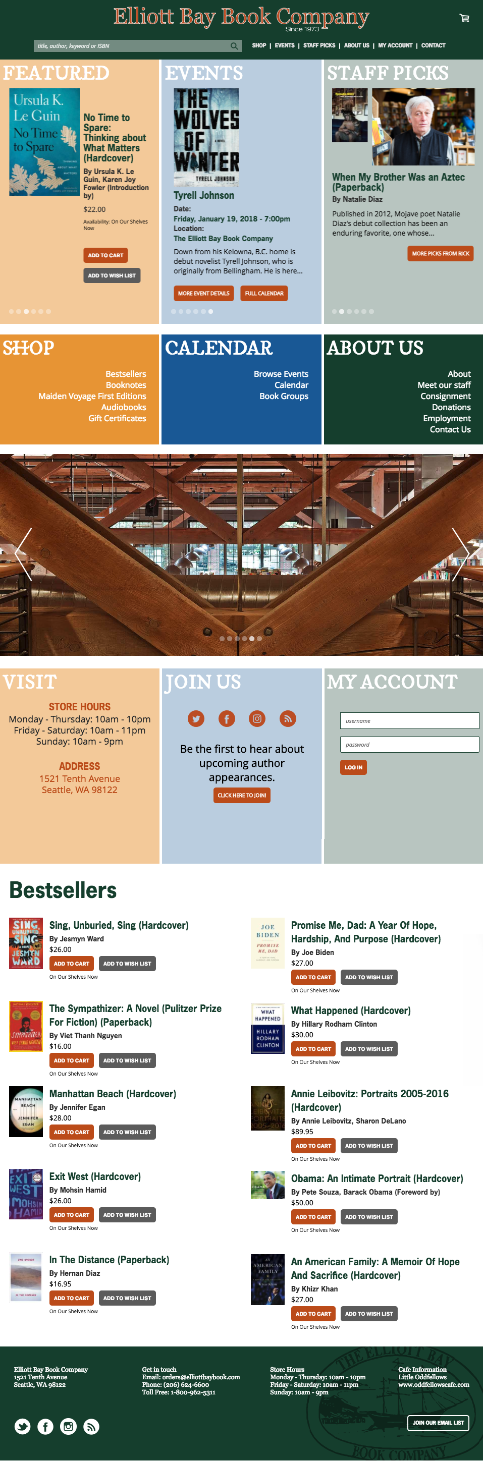
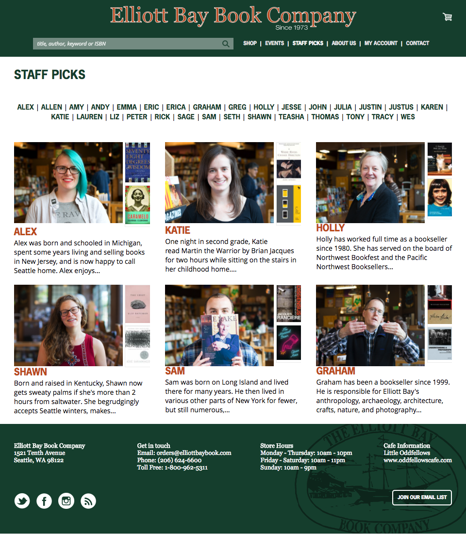
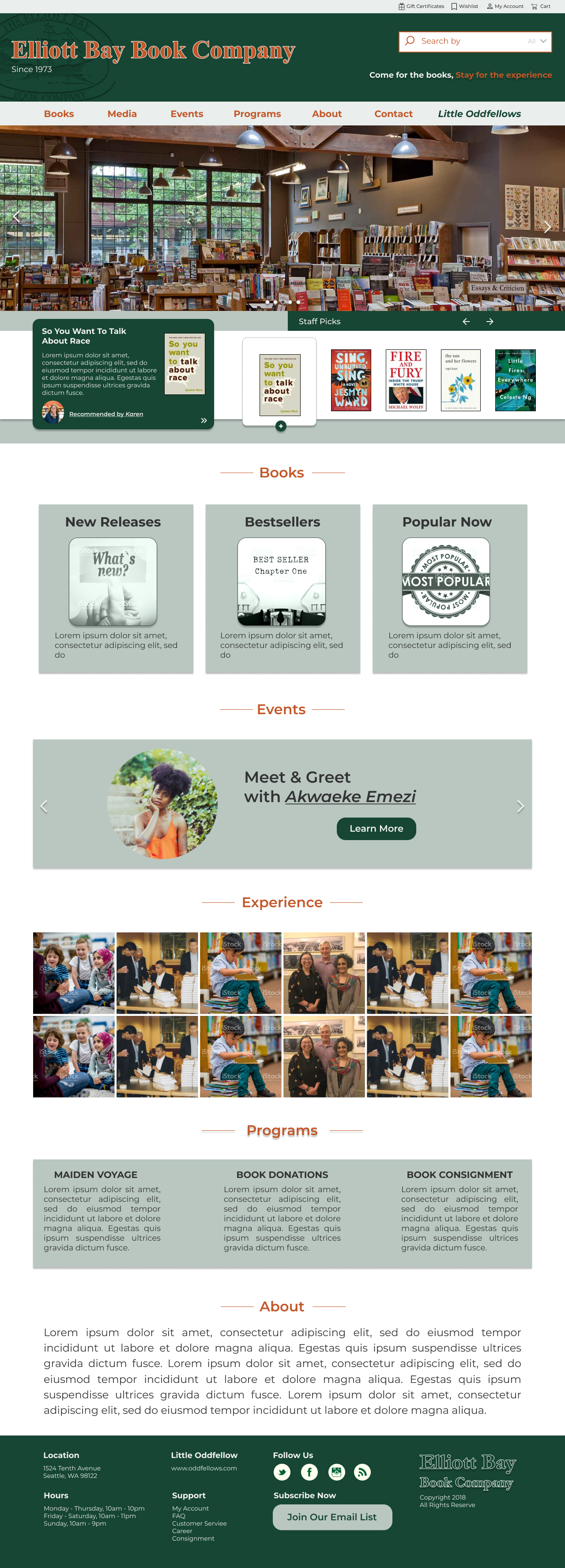
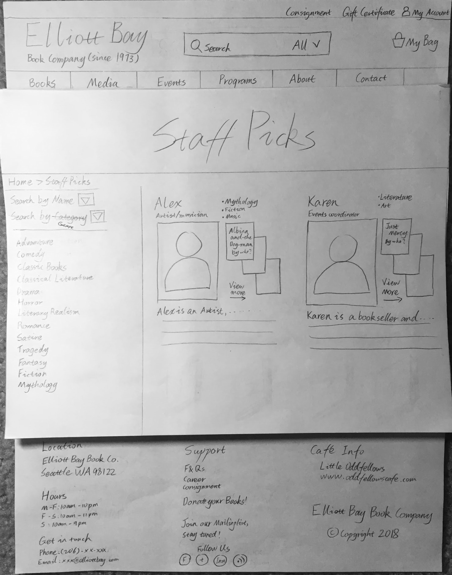
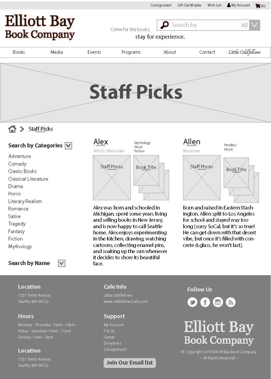
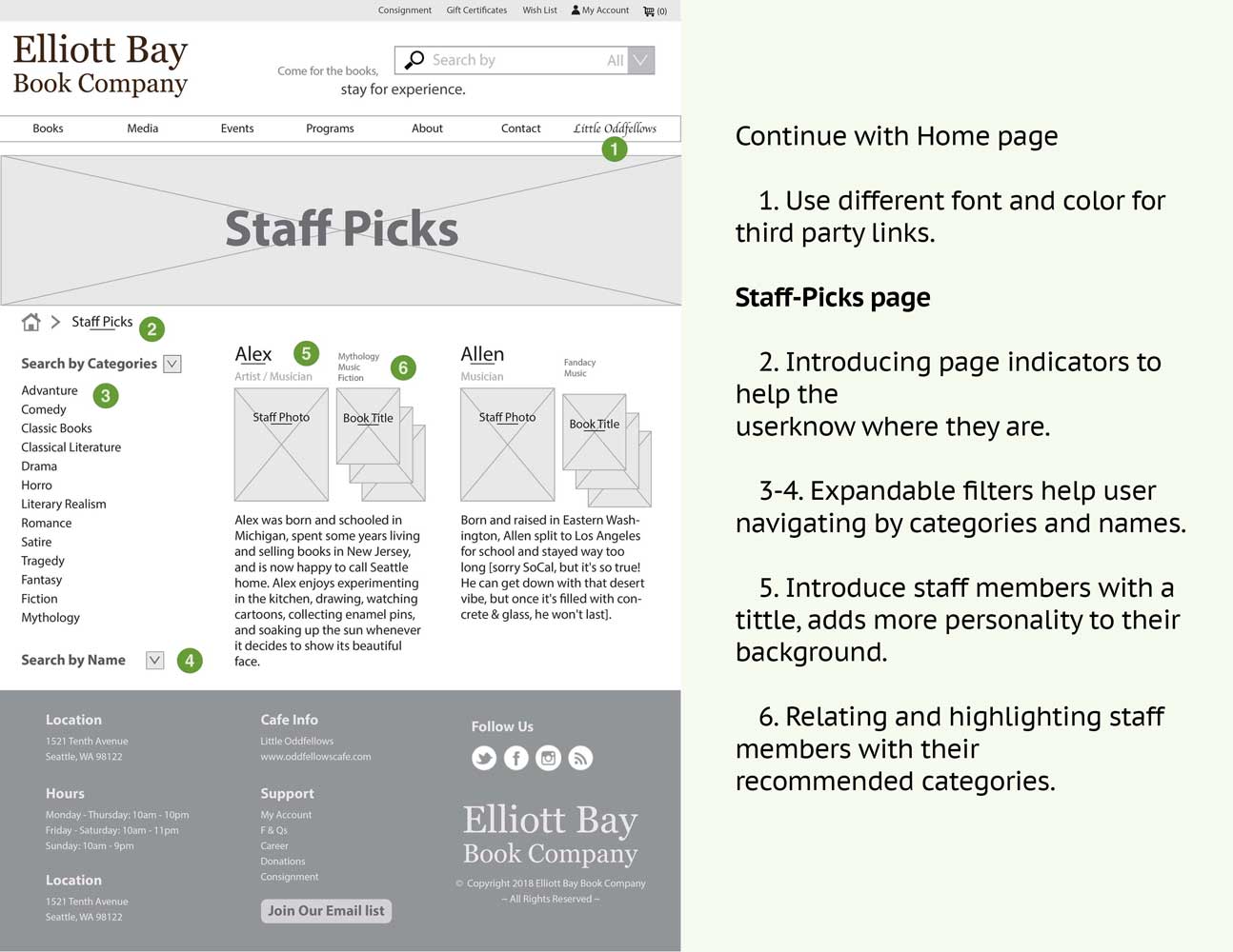
You like how EBBC staff members recommend books to their customers. You visit their website to look for book recommendations by one of their staff members.

Task 1: Find book recommendations from your favorite staff member Karen.

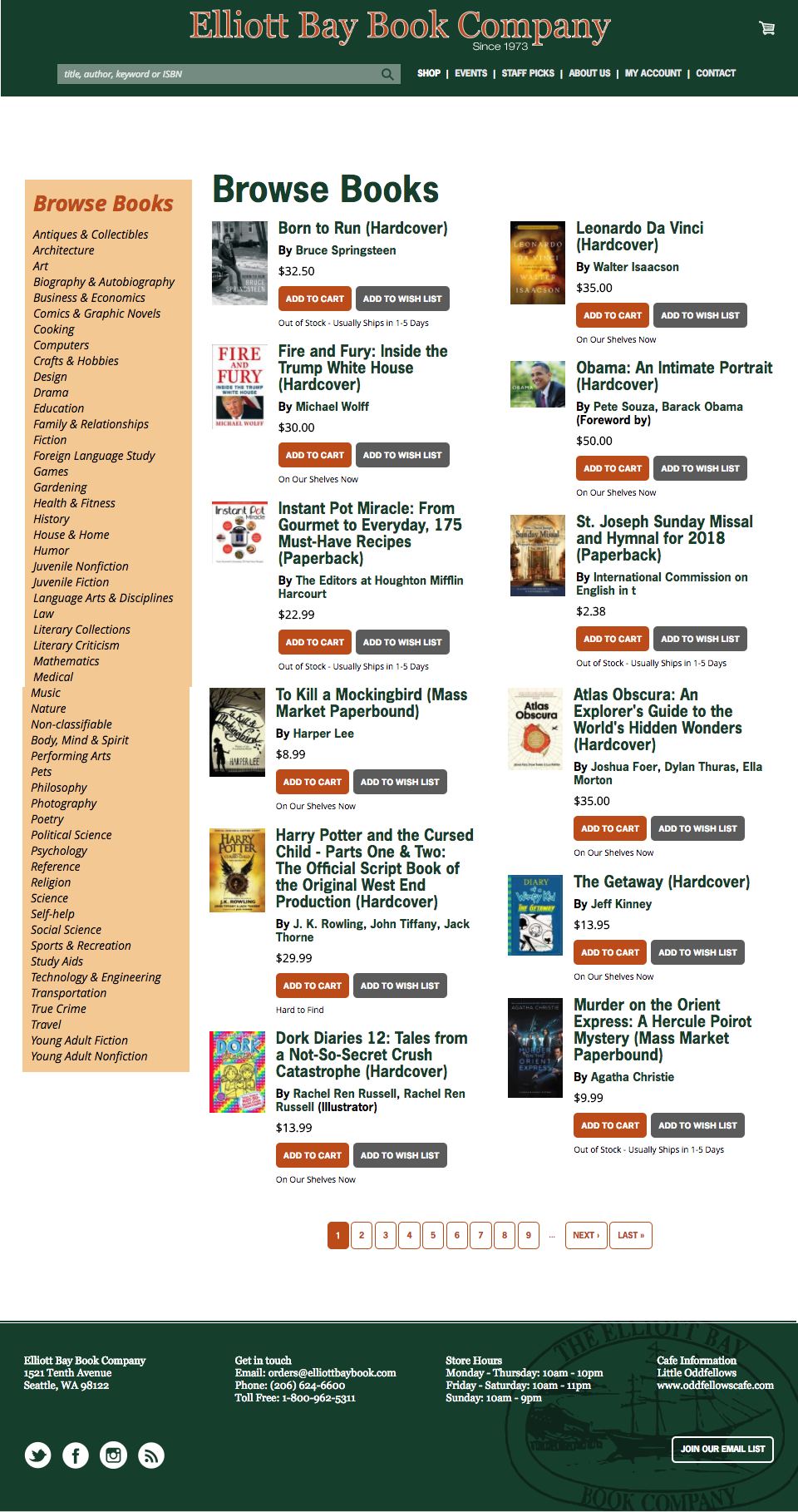
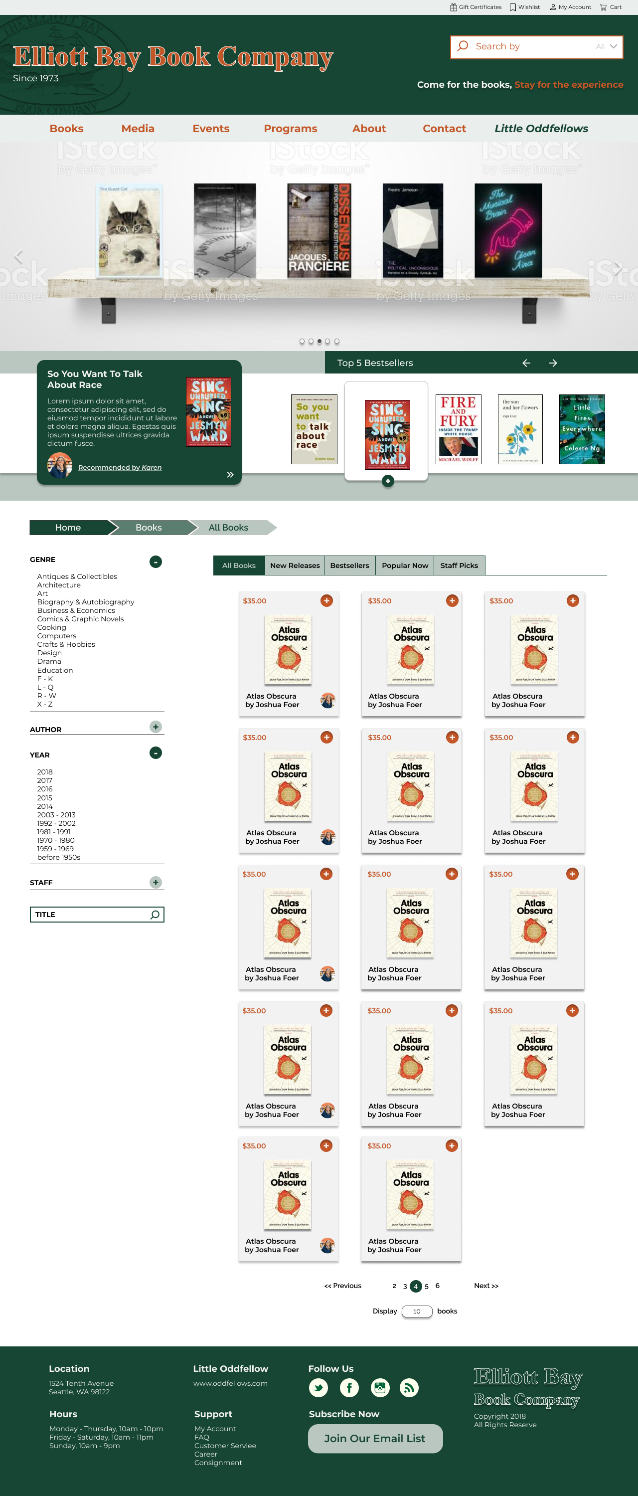
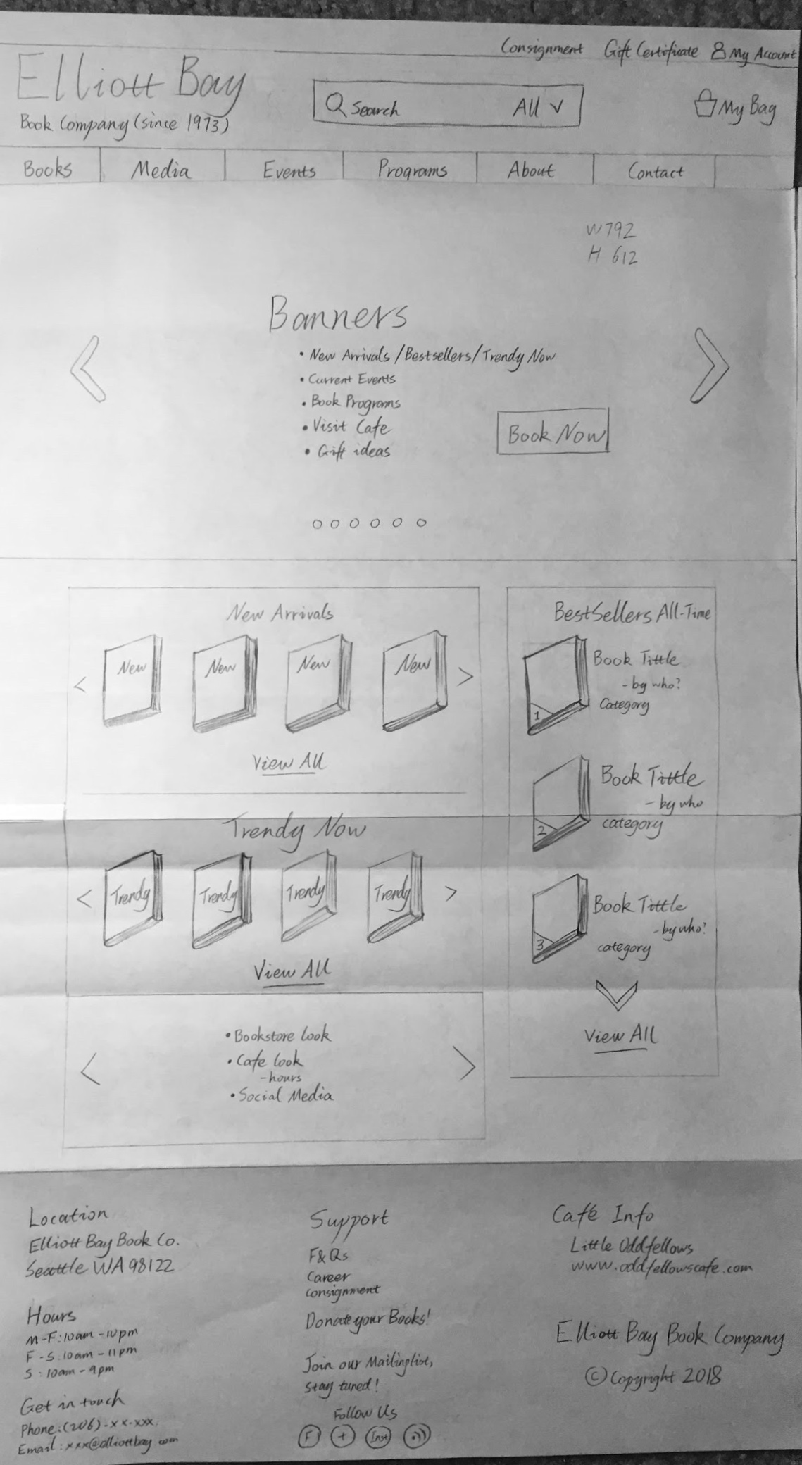
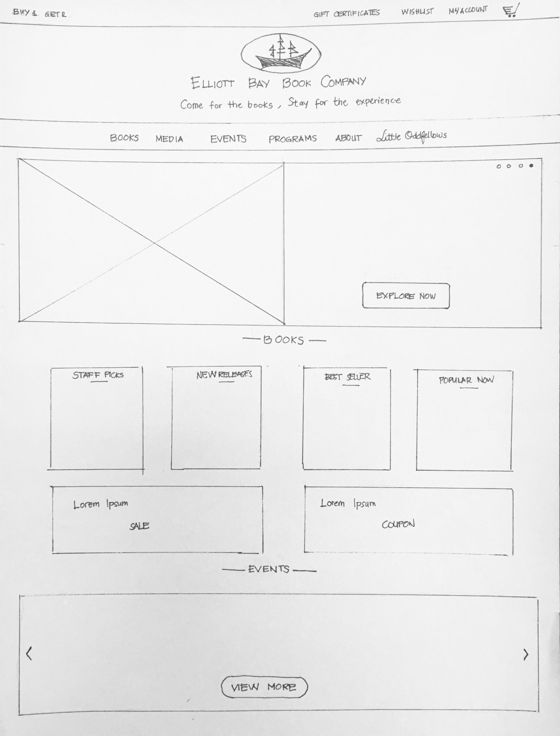
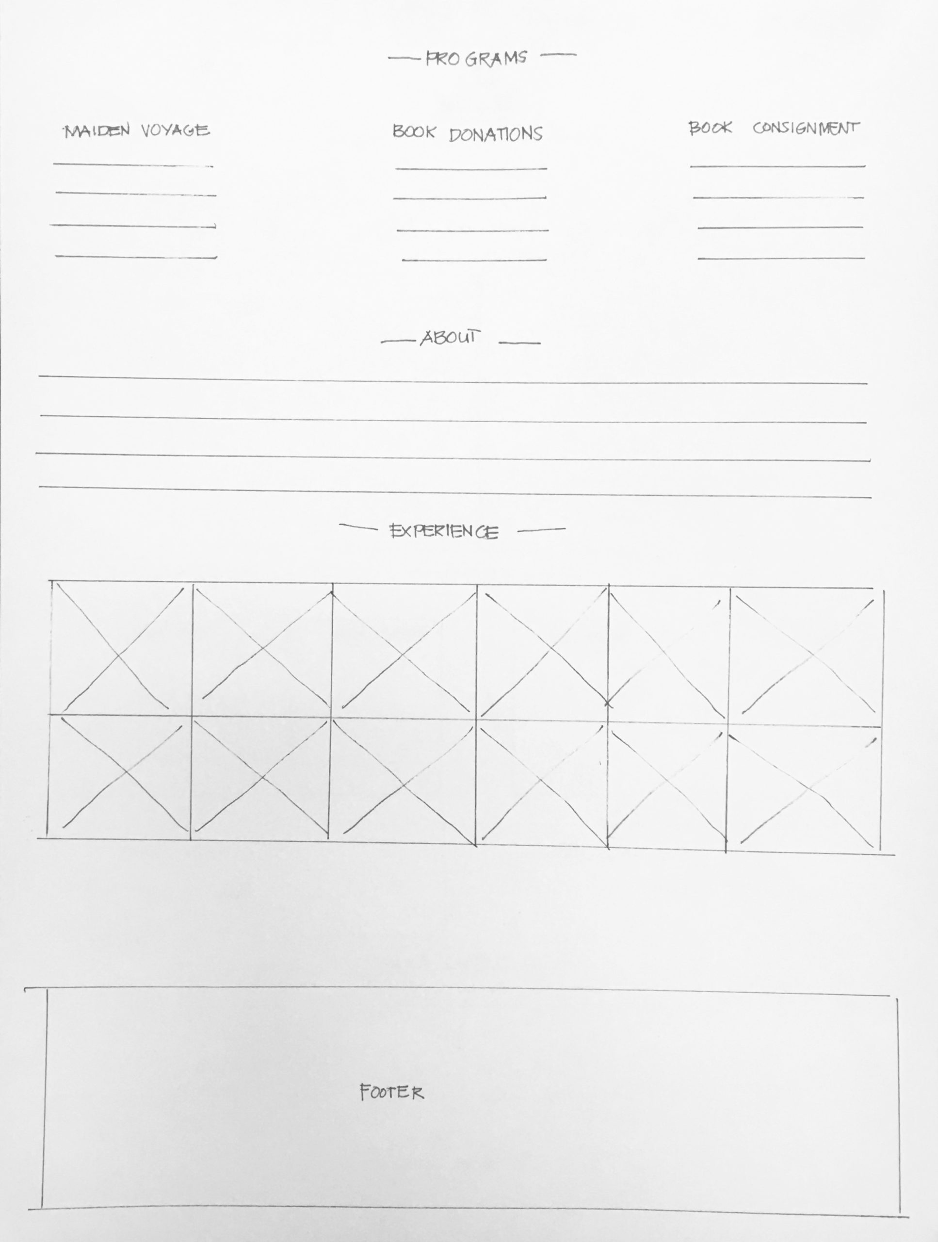
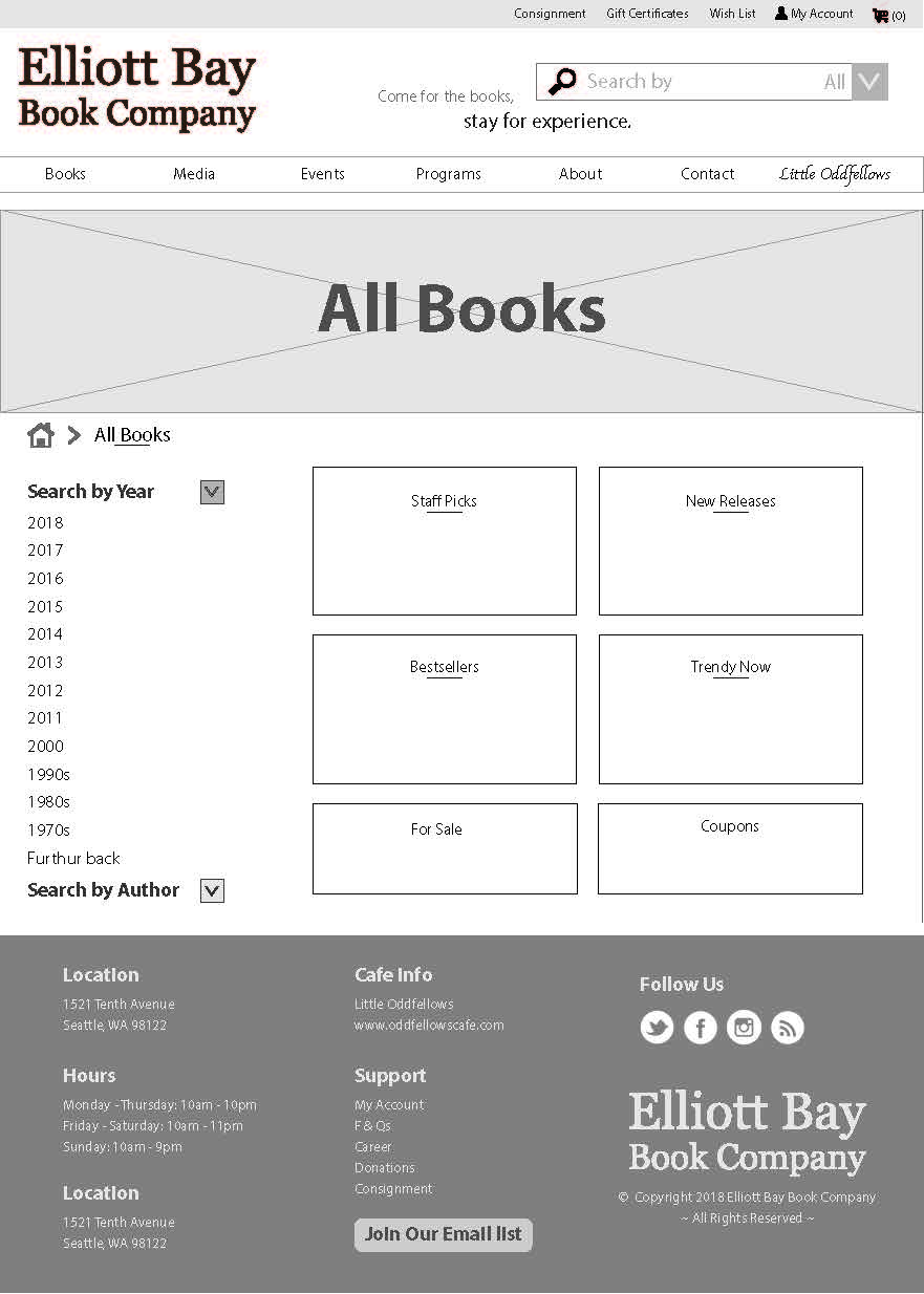
EBBC has a wide collection and selection of books.

Task 1: Find this book called The Secret Letters of the Monk Who Sold His Ferrari.

Task 2: Find the audiobook called The Alchemist.

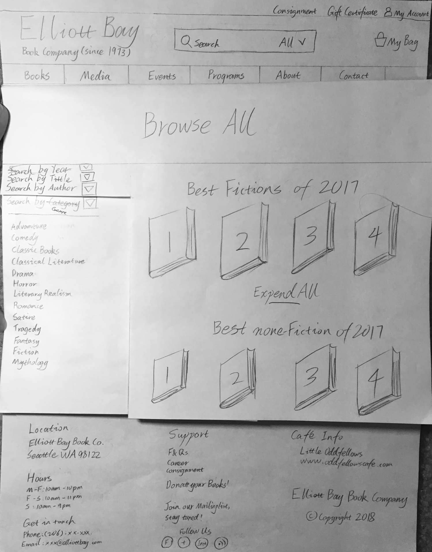
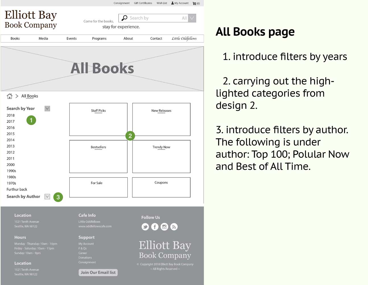
Task 3: Find books on Classical literature.

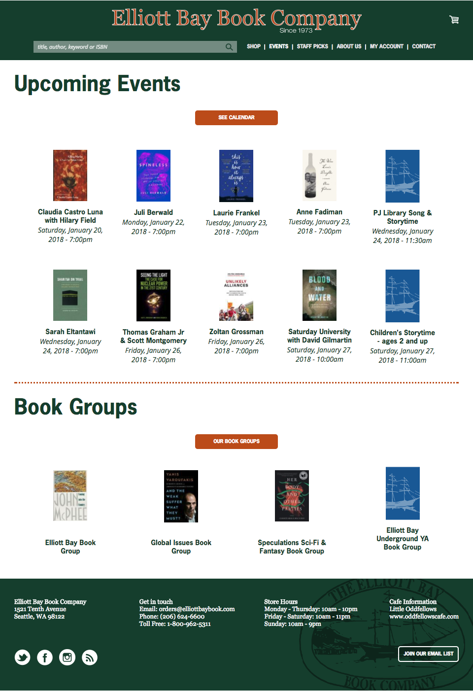
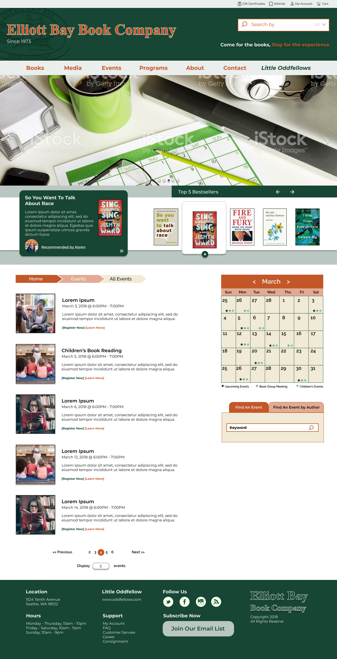
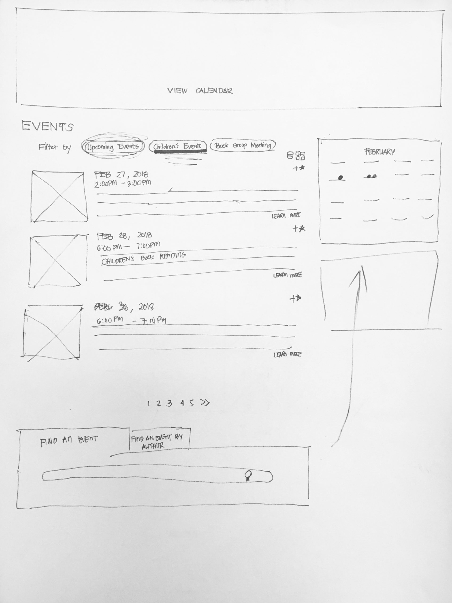
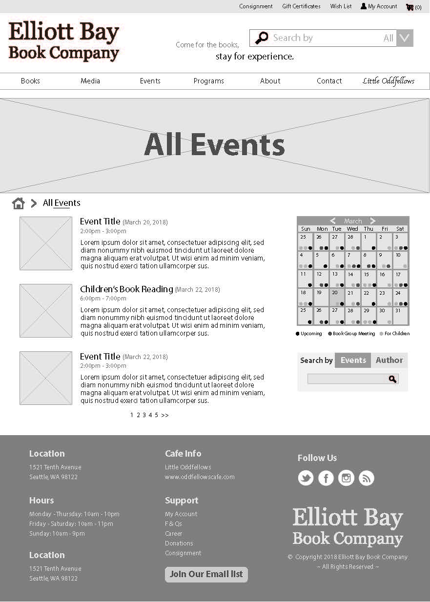
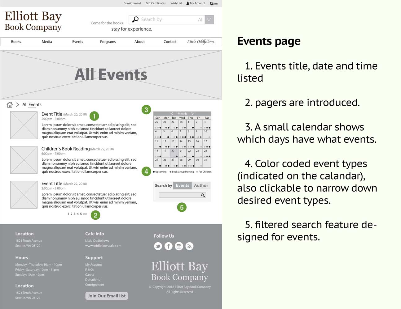
You want to take your 5-year-old nephew to a children's book reading event at EBBC. 

Task 1: Find information on children's book readings.

Task 2: Find out at what time and day does the book reading takes place.

Findings:

KPI = mm:ss.xx, S = Scenario, T = Task, P = Participant, Null = Participant gave up

Scenario & TaskKPIP1P2P3P4P5
S1 - T100:36.0000:38.4200:25.4500:40.0900:20:5600:23.90
S2 - T100:66.0001:24.5400:20.3600:47.6200:13.9500:23.90
S2 - T200:42.0001:26.0400:25.2400:354.60Null01:46.83
S2 - T301:20.00Null02:14.0000:11.8100:18.5002:20.19
S3 - T100:03.00Null00:00.8200:09.5002:11.59Null
S3 - T200:03.00Null00:00.8200:09.8900:03.89Null

Recommendations:

Restructure the information architecture: Choose accurate labels for the navigation schema to prevent confusion.

Employ a filter and sorter mechanism: Provide books with tags and categories, highlight bestsellers, new arrivals and recommended books (by staff member).

Improve the search mechanism: Most participants assumed that the search bar has a universal function across the websites (allowing them to be able to search for events, audiobooks, and other information). Since this is not the case, we could add that functionality or change / move the search bar location to the products (i.e books) page.

Redesign the events page: This section should be populated with events instead of books.

Improve the buying experience across all media platforms: When clicking the audio books from the navigation, open a new tab for the audiobook page, and feature the third party website on the EBBC homepage.

Improve the performance of the search engine: It takes 3 seconds for a search page to load, while Amazon only takes a second to load.

Card Sorting

Categories:

  • Books
  • Events
  • About
  • More

Cards:

  • First Editions
  • Staff Picks
  • Audiobooks
  • Digital Books
  • What’s New
  • What’s popular


  • Calendar of Events
  • Children’s Events
  • Donation
  • Consignment
  • Bestsellers
  • Book Group Meetings


  • Media
  • All Collections
  • Gift Certificates
  • Contact Us

Findings:

Results Matrix
Popular Placements Matrix

Recommendations:

Separating Books and other Media: Many participants expressed that there are too many cards under Books. To break this down, separating Audio Books, Digital books, CDs, and DVDs into another category will make the website more straight forward. 

Adding Media to the navigation: Even though Books are technically considered media, to shorten this label, Audio Books, Digital books, CDs, and DVDs should be under Media. 

Adding Programs to the navigation: Book Consignment, Book Donations, and Maiden Voyage.

Rename and Shorten the following labels

    • What’s New —-> New Releases;
    • What’s Popular —-> Popular Now;
    • Digital Books —-> eBooks;
    • Calendar of events —-> Calendar.

Comparative Paper Prototype Testing

My design partner and I each came up with a set of page designs. We later combined both of them into Design C. 

Design A

Design B

Design C

Paper Prototype

After printing Design C out, I decided to tape, cut, and fold the papers so they act as real webpages. The benefits are as follows:

    • Stay organized and avoid spending too much time shuffling papers
    • Saving paper
    • Avoid using small pieces of paper
    • Simulate the real web page behaviors

Here’s a video demonstration of how I brought it to life:

Design C Explained:

Final Visual Design

The final result inherited the original branding. The Staff page and best sellers have been merged into every page to bring attention. The search and filter system helps browsers quickly find what they are looking for. The event page is visual and informative, and the Footer provides useful links. This visual design is also on Figma.

Other Case studies

Universal Remote

UX + UI + Hardware

View Case Study

King County Bus App

UX + Redesign + On-boarding

View Case Study

Runrr App Design

UX + UI + User Flow

View Case Study