Solution for device management and enhanced entertainment experience.
LWtech: Capstone Project
Professor: Steve Ater
Project Type: Product & Interface
Role: UX Designer
Problem
The universal remotes that are currently offered in the market are too limited in capability or require the users to remember their own button setup or voice commands. Their designs are either too simplistic or too complex. The ones that work with Alexa rely on Alexa, which only works with Smart devices. The remotes that do not work with Alexa have too many buttons.
Some companies let the user download a remote app, in hope of replacing physical remotes. The hassle of looking for a phone in the dark and then looking for the app with a bright screen disturbs the movie experience. Additionally, a smartphone would not allow tactile sensation which is important for muscle memory.
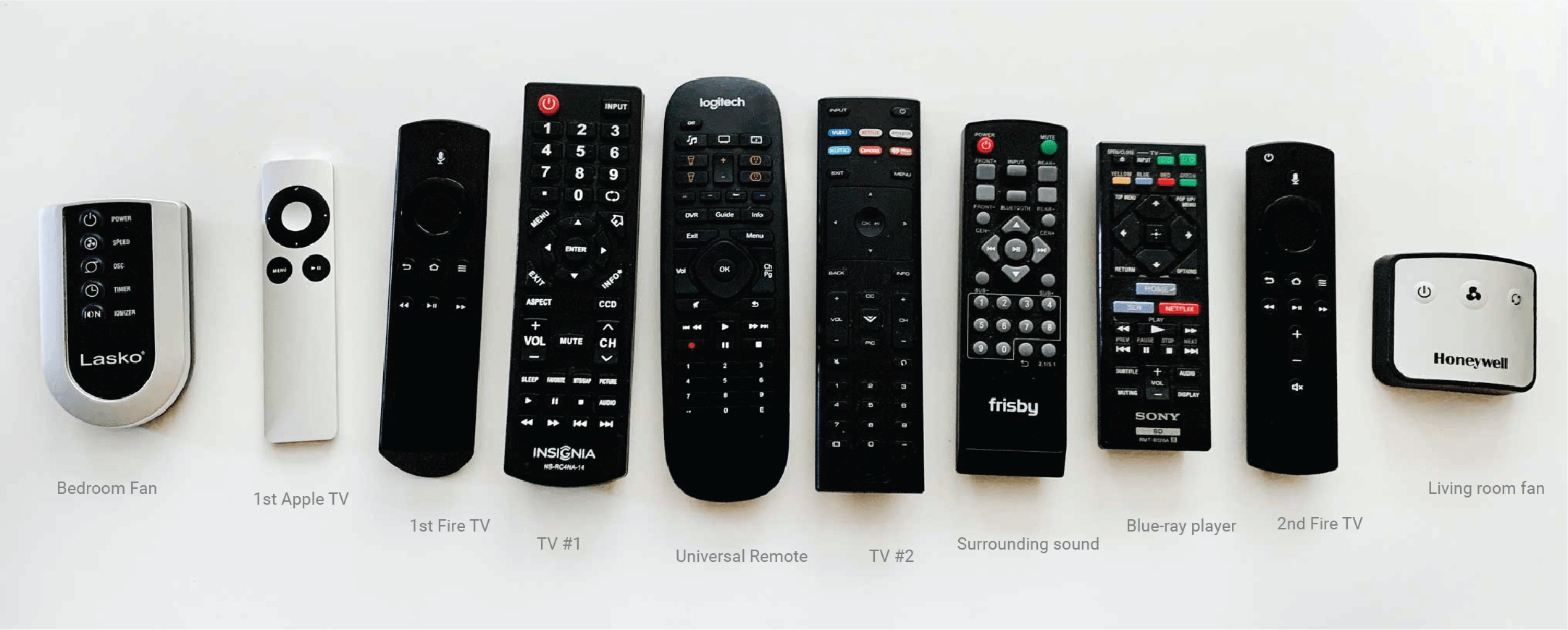
Our remotes in the house
Solution
My remote utilizes sleek intuitive design and fully dynamic icons with feedback that adjusts based on the device the users are trying to control. It features voice control (Alexa) but does not rely on it. Switching between voice and button control is streamlined. Basic function keys (eg. direction key and the return key) utilize long hold, which saves precious space for customizable buttons.
The unique shape of the remote makes it difficult to lose and easy to identify. It’s comfortable to hold and complete control is a thumb away. The button displays are non-distracting and help build muscle memory.
Result
Reduced a typical universal remote’s buttons from 50+ to 12. Minimized a common household’s remotes from 9 to 1.
This Project was awarded and featured twice:
See it at BASD Show & LW Tech Annual Symposium (coming soon).
Feedback
“I need this, and I will buy it. This is exactly what UX design is, and the form is beautiful too. I can’t wait for you to produce it!”
— Steve Ater | BASD Director at LWTech
“I’m glad you got to explore industrial design along with UX design. Your solutions are clever. This project deserves a patent! And your form is sleek!”
— Benjamin Meyer | BASD Instructor at LWTech
Process
Problems
Too Many Physical Remotes
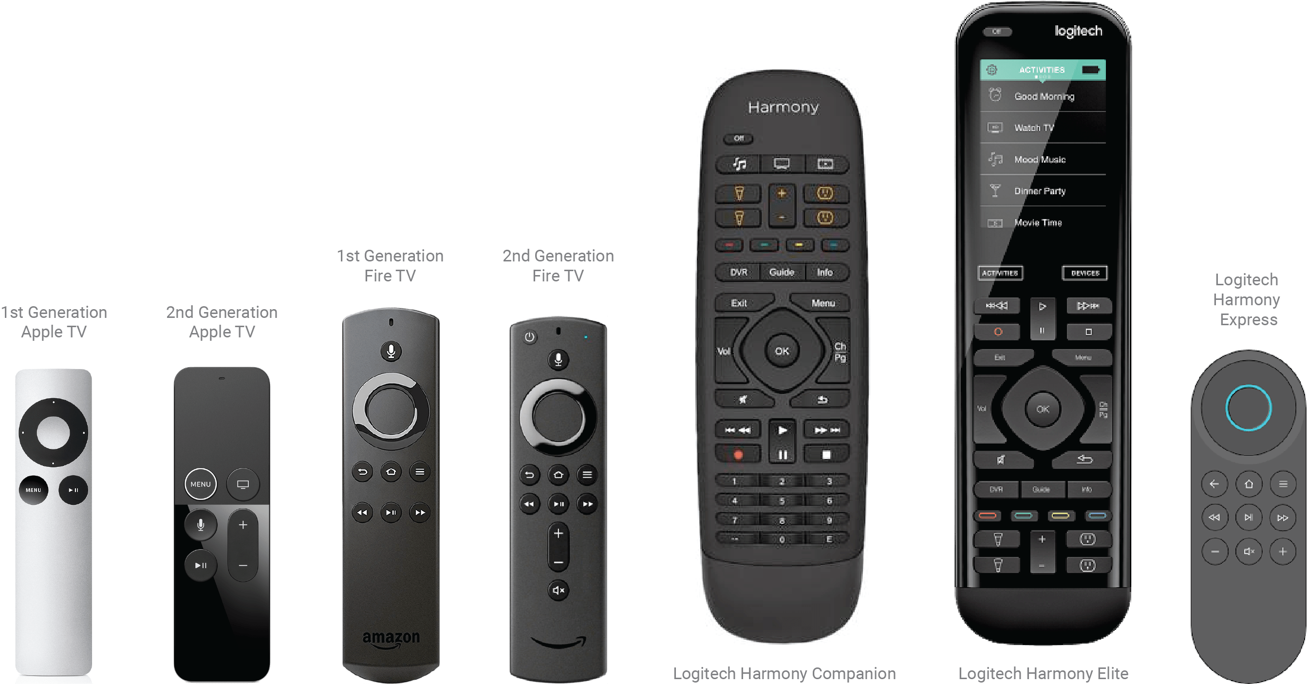
The problem started the first time I stayed at my husband’s place alone when we were still dating. The five remotes on the right were on Jerry’s coffee table and I had no idea how to even turn on the TV.
For years, I have only had 2 remotes: one for my TV and one for the Apple TV. Jerry has 5: TV, speakers, fire tv, DVD player and a fan. When I want to turn down the sound, I have to use the speaker remote, when I need to turn on the TV, I use the TV remote, and when I need to find things to watch… you get the picture.
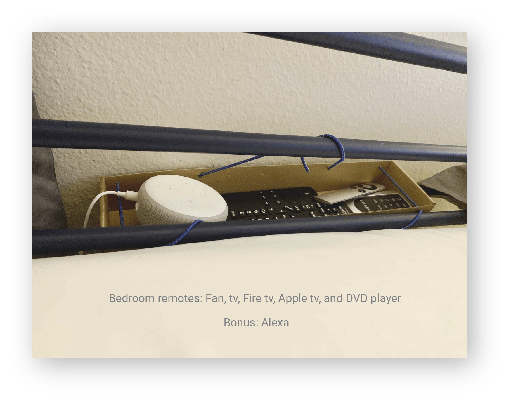
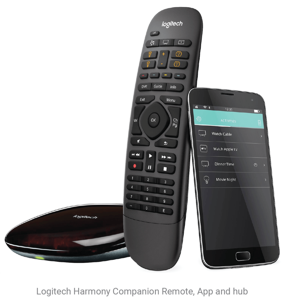
Eventually, when we moved in together, I bought a Logitech universal remote, hoping it would simplify our lives. However, Jerry never learned how to use it, and now we have 6 remotes sitting on the living room coffee table, 4 in the bedroom, that’s a total of 9 remotes! I think it’s now safe to say that we need to do something about this.
Terrible On-boarding Experience
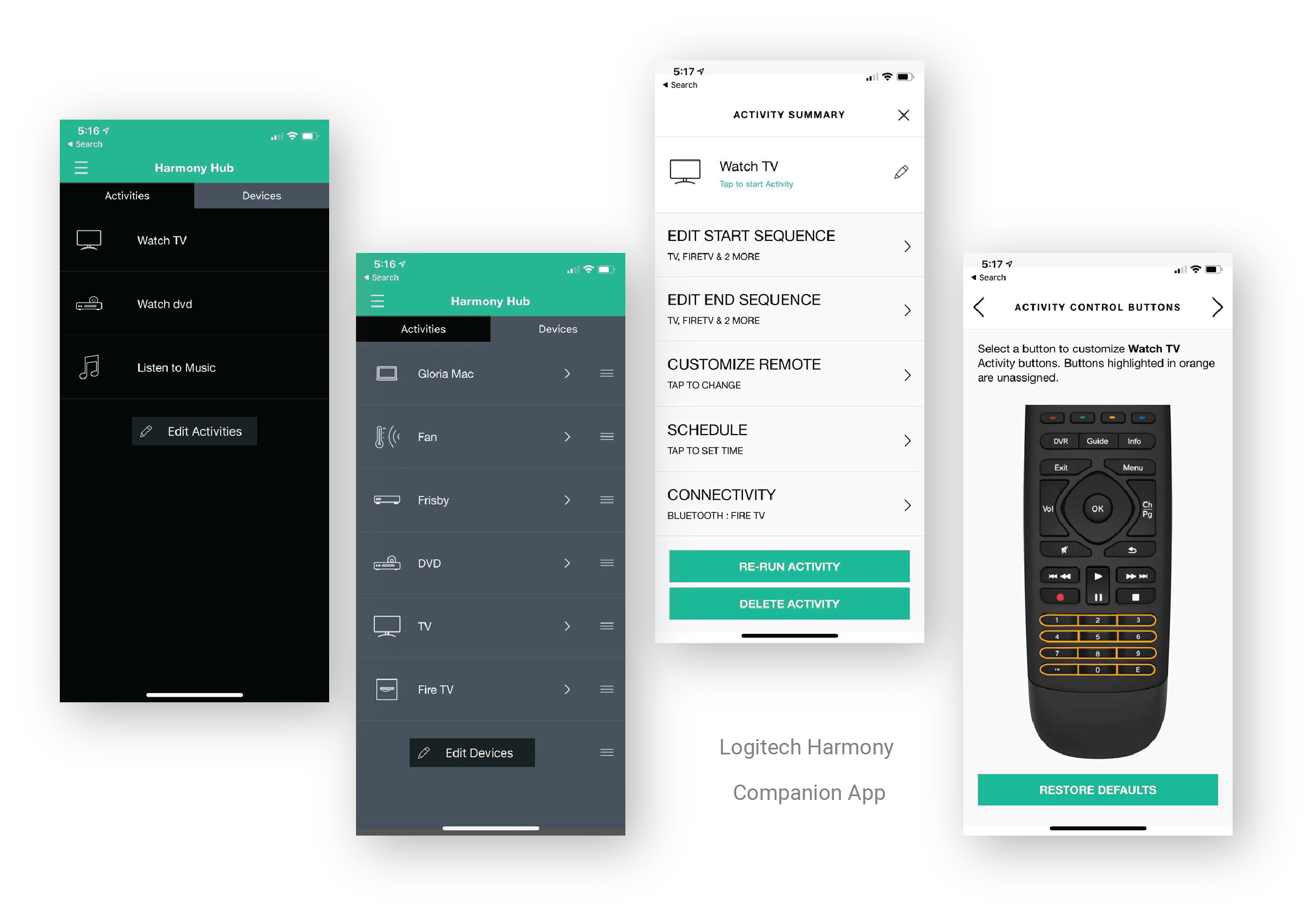
The Logitech universal remote definitely helped me, but not Jerry. And even for me, it was a painful process.
I had to use the Harmony app to program the universal remote which was very time-consuming because once I made a mistake, I had to start over.
If the app would easily allow me to go back a step when I make a mistake, it would not take me all day. If the remote didn’t have so many unnecessary buttons, maybe Jerry would be willing to learn it too… Because of this terrible experience, when we get a new device, I would be less likely to add it to the remote.
Rationale
Many people still enjoy a physical remote because it allows them to touch, feel and physically push a button. Instead of having to find their phone, look for the app, find the device and finally arrive where they want to be, a well designed remote allows the user to arrive at their destination within a couple of seconds. Its minimalist design (as few buttons as possible) will encourage users to explore its possibilities and accomplish more with one simple device.
Values
Most households are using multiple remotes to control one experience. If we can figure out a way to combine all of the remotes effectively, this would simplify device management and reduce electronic waste.
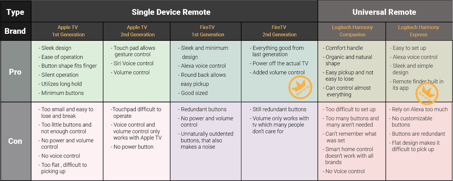
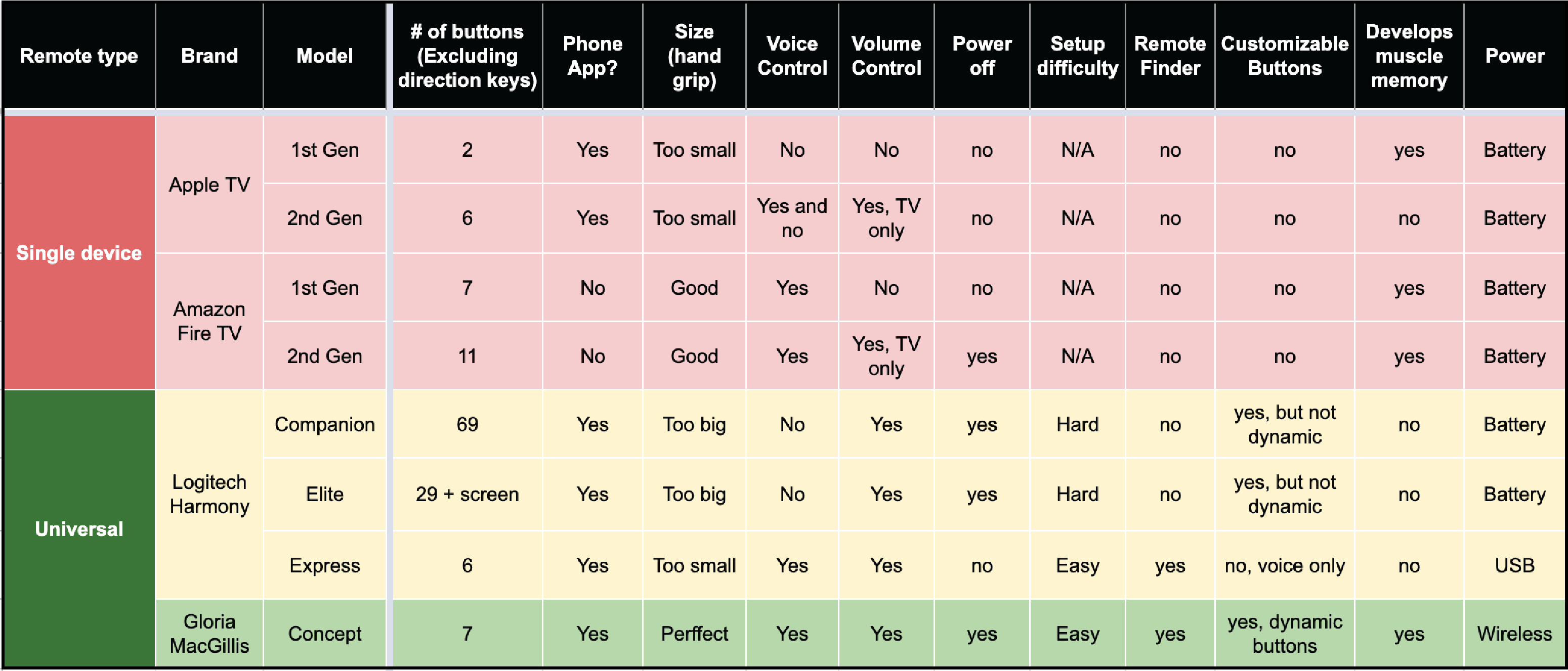
Competitive Analysis:
Logitech Harmony Elite is a combination of the Companion and its phone app. This model is not compared in the following analysis because having to look at another full on screen is not my goal.
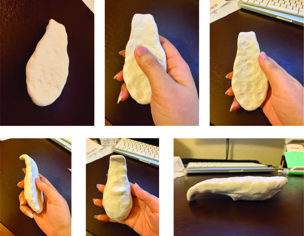
Modeling Clay
To explore how the remote should look and feel when held with a hand. I decided to experiment with some modeling clay.
This small half avocado shape came out natural and fast. It fits right in my hand and I was able to push every button by just moving my thumb. However, it couldn’t lay evenly on a table, so I stretched the top to make it curve and extend down onto the table. Well, this is an interesting shape, I thought.
After a long period of time holding this model, I started to create a dent on the back where my index finger is. The dent is there to stay.
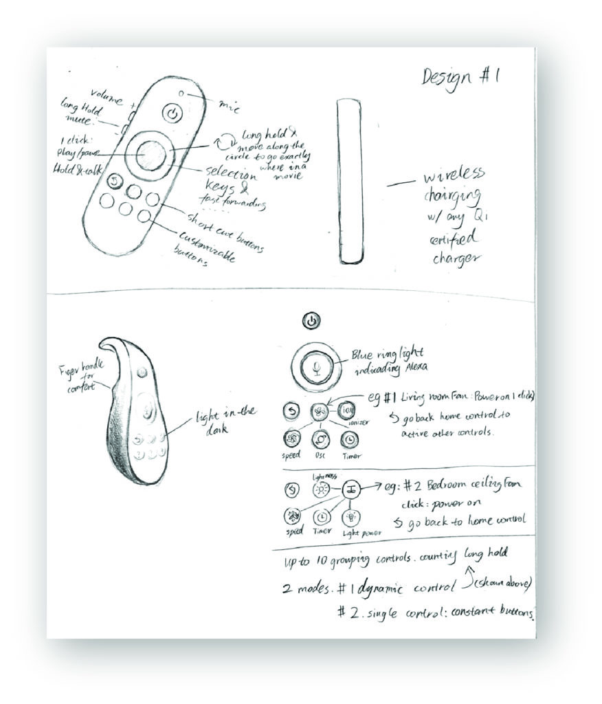
Sketch
My first sketch is a very standard remote but has all the basic features I wanted. The second sketch is cooperating with the modeling clay.
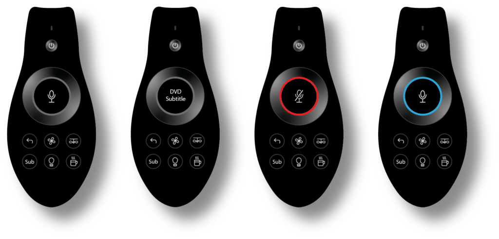
In order to have truly customizable buttons, the icons must be adjustable by the users. So I thought, why can’t I just make the buttons tiny screens? They should change depending on what you press so they can control up to 5 groups of devices. Although there are just 5 buttons, if they are dynamically adjustable, it makes this little remote so much more powerful!
Icon and Feedback Development
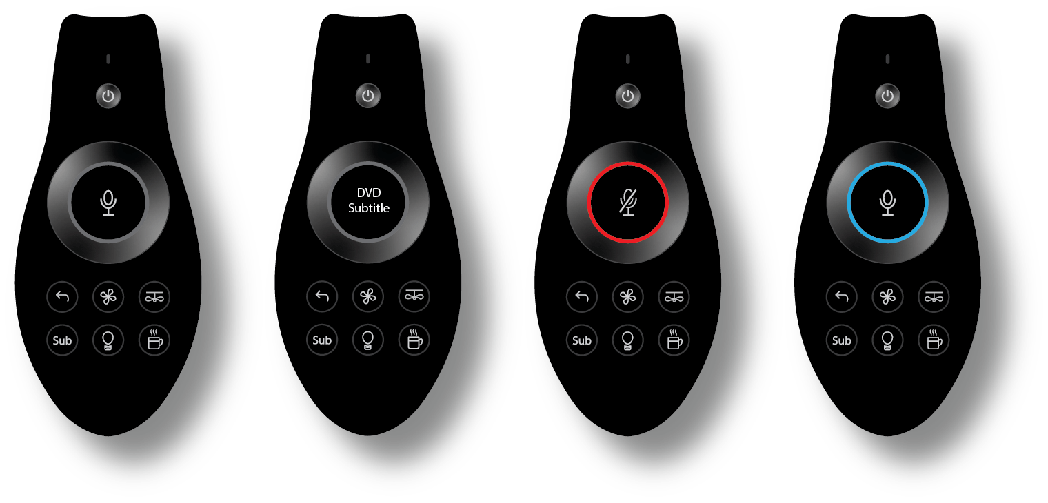
Home device icons are difficult to understand. They are not as universal as the icons we use everyday. No matter how well these icons are designed, each user might have their own interpretation. I don’t want my users to have to remember or guess what each icon means. My goal was for them to operate this remote with 100% confidence and know exactly where they are going. So I decided to combine letters with icons. (Eg. the fan icon with letter L means living room fan). However, in a tiny scale, none of these icons were readable.
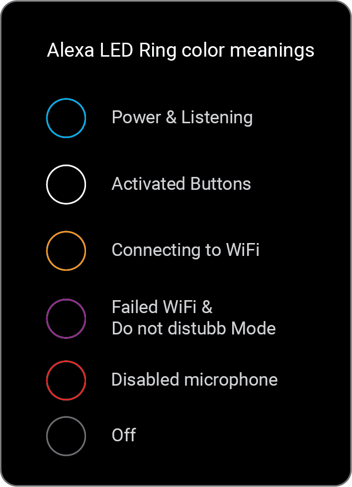
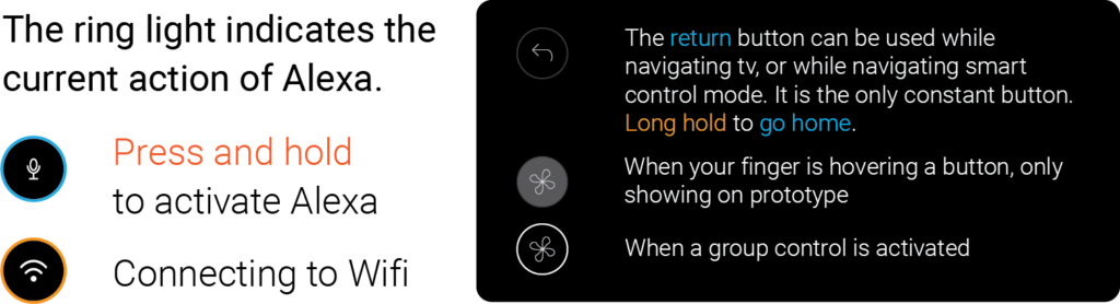
Then, it hit me. If the user is trying to operate buttons, they aren’t currently interested in talking to Alexa, so why don’t I turn the Alexa button into a feedback display so that the user could have the full clue what they are about to enter. This should also help the users to develop muscle memory. The return button is always there, so the user can easily go back and engage with Alexa again.
In this case, the LED light can not always be blue when we are navigating smart home controls. I then did some Alexa color signal research and decided to corporate them into my design.
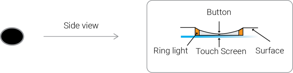
Buttons are slightly indented to fit the curve of a finger. They feel like buttons and act as tiny screens that can be customized any way you wish.
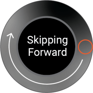
Direction keys
Direction keys on a traditional remote are useless when something is playing on the screen. On this remote, they can be used to skip, rewind and adjust volume. This should be very intuitive and it saves precious space for customizable buttons.
Pressleft or right to skip or rewind;
Press and hold to activate the progress bar.
The ring represents the progress bar from beginning to end.
Move your finger along the ring to go to the exact location. Let go when done.
Double click to skip or rewind chapters if the device supports it, if not, this action will make the process faster.
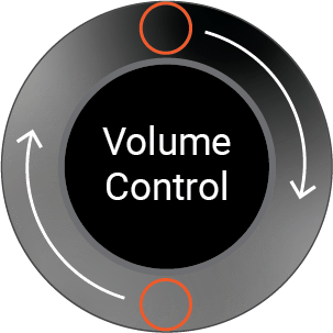
Pressup or down to control volume;
Press and hold to activate exact volume control.
The ring represents volume from 0 to max. Move your finger along the ring to adjust to the ideal volume.
Double clickUP for max volume; Double clickDOWN to mute.
Information Architecture
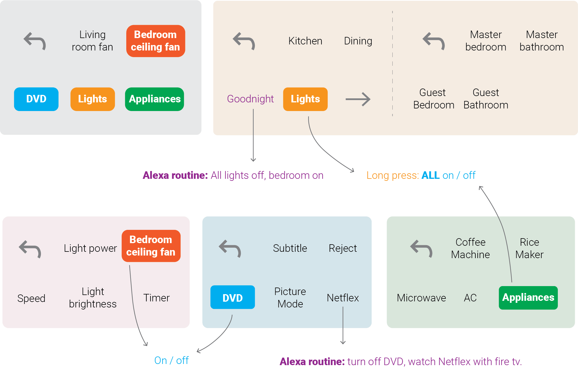
I had only came up with 5 groupings, but now the possibility is endless since my buttons are now tiny displays. If the user wishes to control more than 5 devices, the last button would turn into a “next” button.
Now, this remote allows up to 9 customizable grouping controls, and 3 layers of nesting control. There’s a limit only because I don’t want to overwhelm the user.
The graph below is an example of how this particular user set up their remote assigning which devices and preferred shortcuts they desire to control.
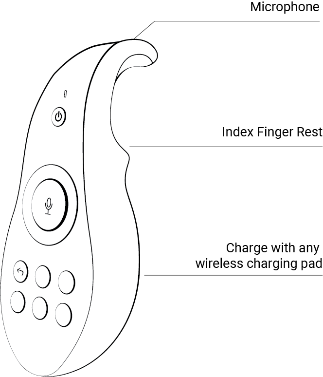
Final Remote interface
This remote is black with a matte finish for non-distracting screen time. The curve in the back allows for easy pick up off of any surface, and it’s charged wirelessly by any Qi-certified charging pads. Its organic shape makes it comfortable to hold. The size is small enough for a thumb to travel from bottom to top without having to reposition the remote. The index finger rest will also keep it stable in one’s hand.
All buttons except the power button are indented inward for comfortable touch. The navigation button ring has a glossy finish. It’s flat and raised to the surface, so a thumb can comfortably move along the circle to control volume or skip and rewind.
All displays and illumination will be turned off until it’s picked up. This remote is hard to lose because of its size and unique shape. However, if lost, its companion app will make it sing a pleasant song.
Final Comparison
The universal remotes that are currently offered in the market are too limited in capability or require the users to remember their own button setup or voice commands. Their designs are either too simplistic or too complex. Additionally, tactile sensation is important for muscle memory. My remote utilizes sleek intuitive design and fully dynamic icons and feedback that adjust based on the device you are trying to control.